Consolidated Holdings
Together we stand.
United we triumph.
An identity built around unity and resilience, extended into a consistent family of print, workplace and signage concepts.
Bringing complexity
into unity.
The Consolidated Holdings presentation introduces a new identity built around simplicity, strength and resilience. Its central idea is consolidation itself: separate parts coming together to form a clear, unified whole.
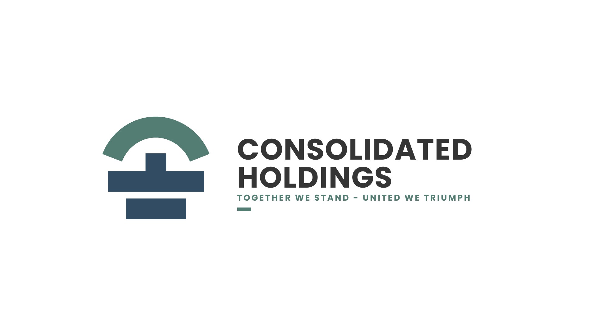
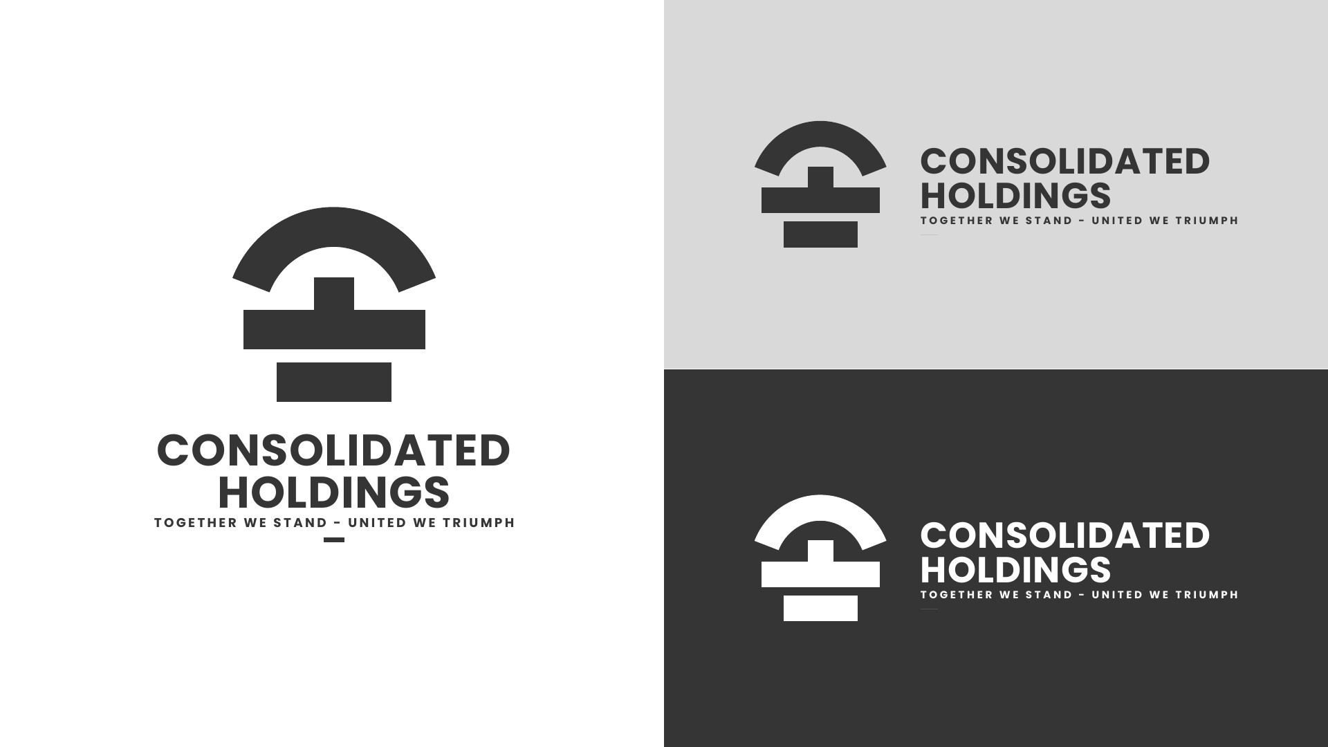
The proposed mark replaces the linked shapes of the earlier identity with a more structured geometric symbol. A bold wordmark and the line “Together we stand - United we triumph” carry that idea into the wider visual language.
Two initials.
A single statement.
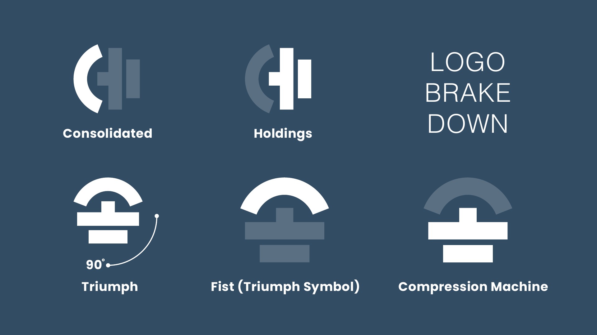
The supplied rationale describes rotating the initials C and H through 90 degrees to create a fist-like form: a symbol of triumph and resilience. The progressive reduction of the elements also draws on the motion of a compression machine.
The arch, central bar and lower rectangle create a compact silhouette. Their clear separation allows the mark to retain its structure in full colour, monochrome and reversed applications.
Quiet confidence.
A clear message.
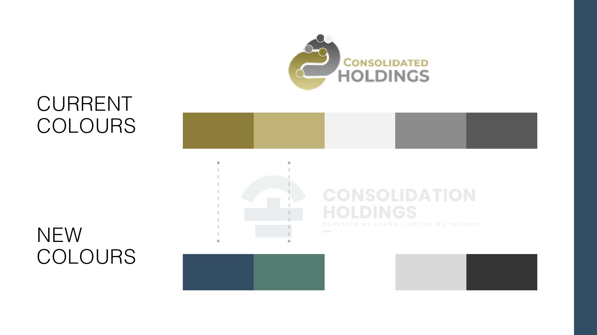
The presentation moves from the earlier gold-and-grey palette to slate blue, muted teal and neutrals. The cooler tones give the proposed identity a restrained, industrial character.
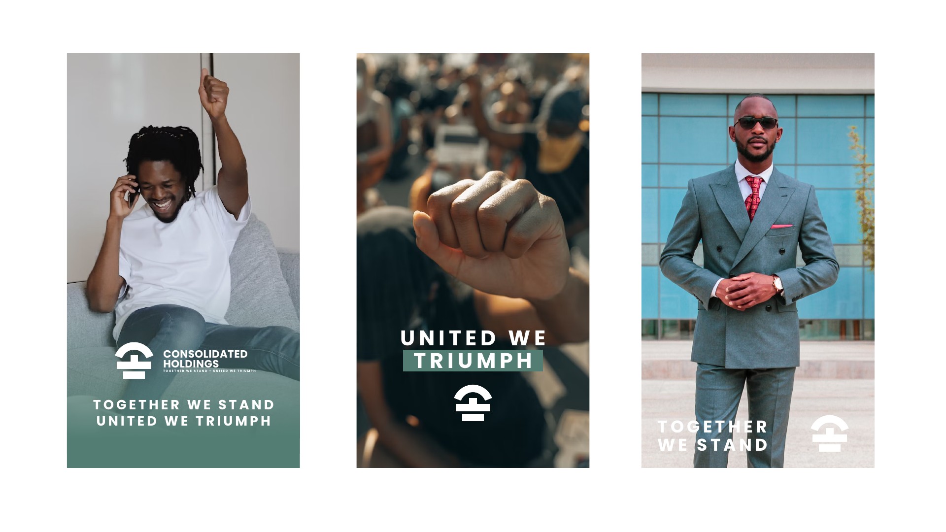
The campaign layouts use short statements, strong typography and human imagery to express standing together and shared triumph. Those supplied layouts establish the voice used alongside the new mark.
Consistency starts
with the details.
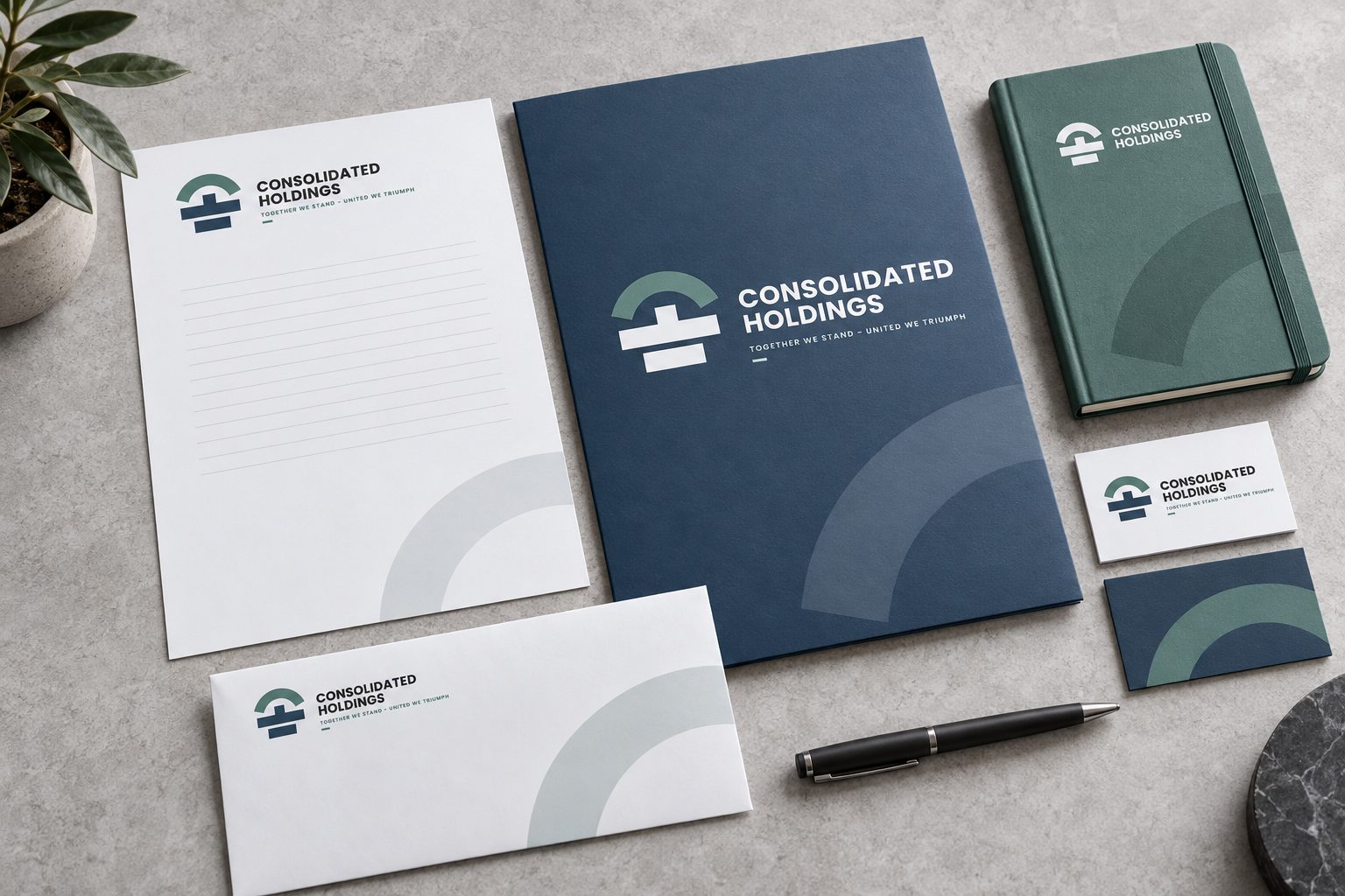
The stationery concept brings the identity into everyday business communication: letterhead, envelope, folder, notebook and matching cards. White space keeps the pages useful, while slate-blue and teal pieces give the collection a recognisable rhythm.
Small emblem details and a restrained approach to colour connect the formats. This extends the supplied visual language into a proposed print system.
An introduction
with substance.
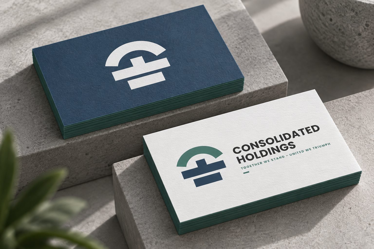
The business-card concept pairs a crisp light face with a darker reverse, keeping the emblem and company name at the centre of the design. The colour contrast makes the same identity work at a smaller scale.
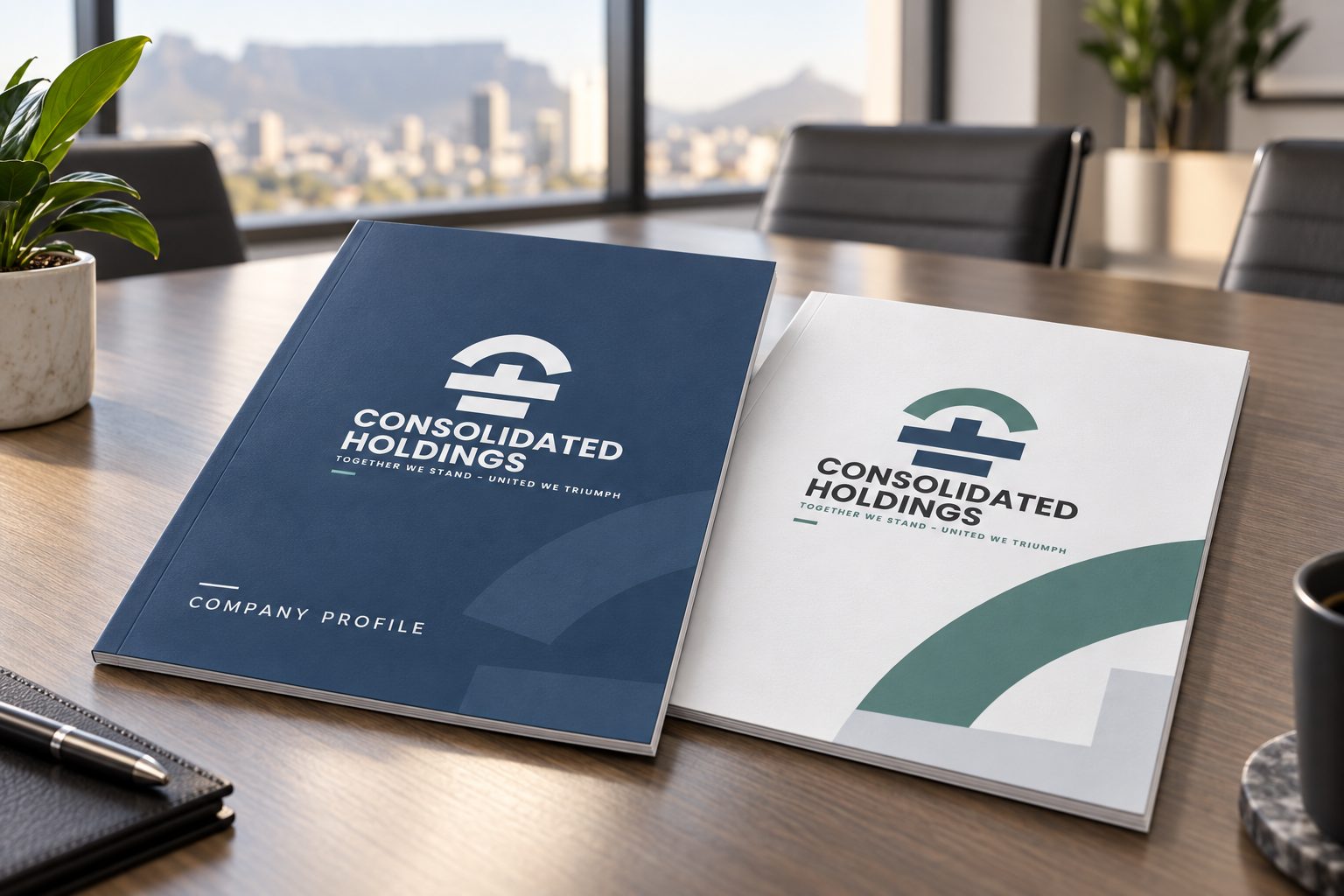
The company-profile cover concept uses a larger format and more open space. Its purpose is to explore a consistent document style; it does not imply that a finished profile or corporate report was part of the supplied work.
A recognisable
place to arrive.
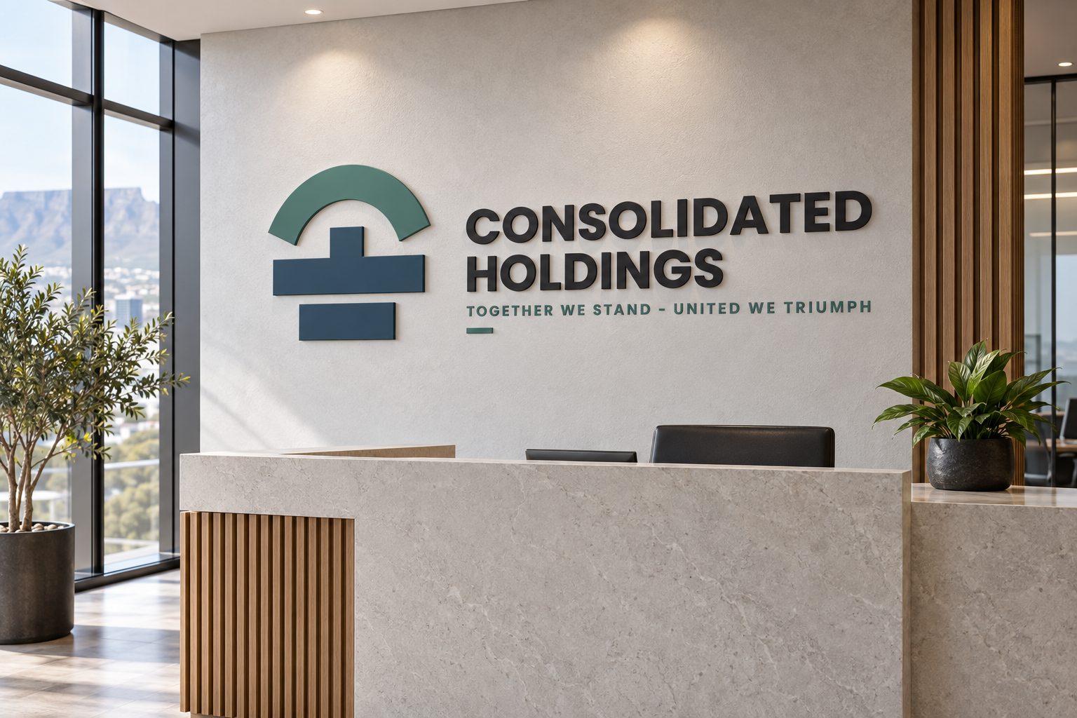
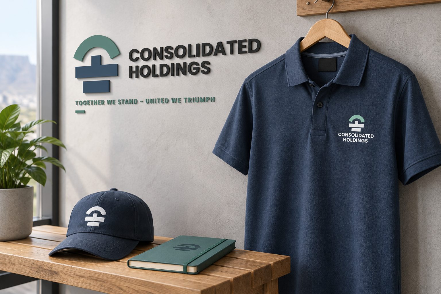
The reception concept translates the flat emblem into a dimensional sign. Teal and slate-blue elements sit beside dark lettering on a pale wall, keeping the identity readable within an architectural setting.
A polo shirt and cap explore a smaller, stitched application. These concepts show how the same mark could connect the workplace with the people representing the group.
One group.
A wider presence.
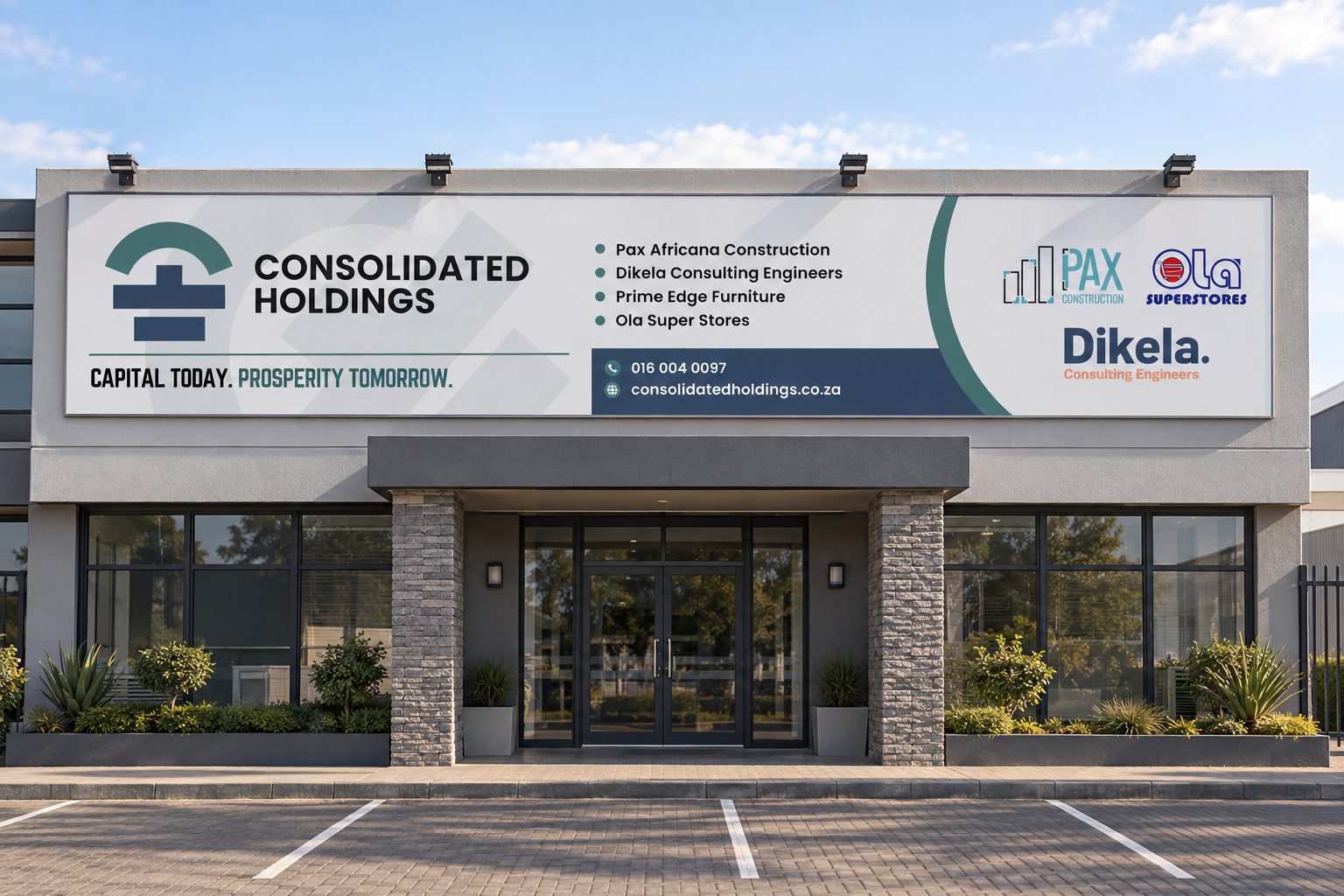
The supplied billboard artwork places Consolidated Holdings alongside Pax Africana Construction, Dikela Consulting Engineers, Prime Edge Furniture and Ola Super Stores. The design gives the group name a prominent position, then organises the supporting names and contact information into distinct areas.
Its line “Capital today. Prosperity tomorrow.” introduces a different message for the large-format setting. The artwork shown below comes directly from the supplied Illustrator file.

From artwork
to its setting.
The installation concept places the billboard across a commercial facade to explore its scale and visibility. The long format gives the main identity, business names and contact strip room to work together.
Across the expanded collection, the emblem remains the anchor. Colour, type and proportion adapt to each surface while preserving a consistent visual identity.
For holding companies & corporate groups
Can you design an identity for a holding company with several businesses?
Yes. We create group identities that bring separate companies together under one clear mark — for Consolidated Holdings, the initials C and H form a single, resilient symbol, and the group billboard organises several member companies around it.
Can you rebrand a group that already has a logo?
Yes. We work from your existing identity and explain the new direction: Consolidated Holdings moved from linked shapes and a gold-and-grey palette to a structured emblem in slate blue and teal.
Do you design company profiles, stationery and billboards?
Yes. Brand identity work extends into marketing collateral — stationery, business cards, company profiles, signage and large-format artwork like billboards.
What does a corporate identity project include?
Typically logo design, colour, typography, brand language and guidelines, then the applications you need. The exact scope, timeline and fees are set out in your proposal before work starts.