Latroforce
Efficiency. Agility.
A new expression.
A proposed identity for a business focused on building better businesses — bringing Latroforce’s management services together through a refined emblem, a flexible pattern system and practical brand applications.
In collaboration with
Familiar energy.
A lighter expression.
Latroforce partners with businesses to provide management services across cleaning personnel, cleaning equipment and machines, safe working and operational procedures, waste management, gate and access management, and the manning of access points.
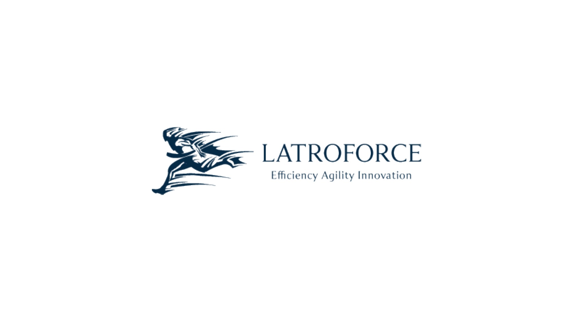
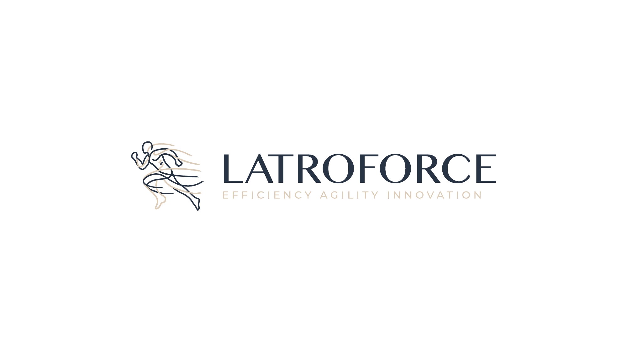
The proposal explores a new visual direction for Latroforce while retaining its name and the line “Efficiency Agility Innovation”. A fine-line running figure replaces the heavier illustrated emblem shown at the start of the proposal.
The following designs are presented as proposal work. They show the direction of the identity, rather than a confirmed launch or completed rollout.
One mark.
Room to move.
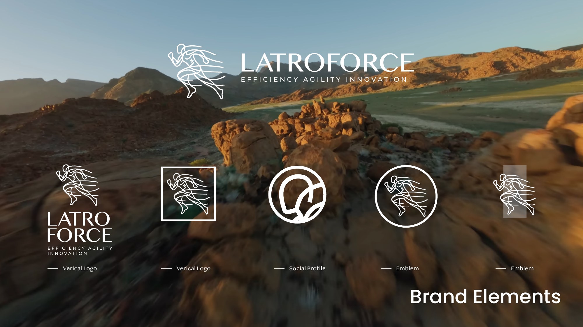
The running figure carries the sense of motion into a more open, linear mark. The proposal pairs it with the Latroforce wordmark and explores horizontal, stacked and emblem-only arrangements.
These variations give the identity options for wide layouts, compact spaces and profile images, while keeping the same visual character.
Movement,
made graphic.
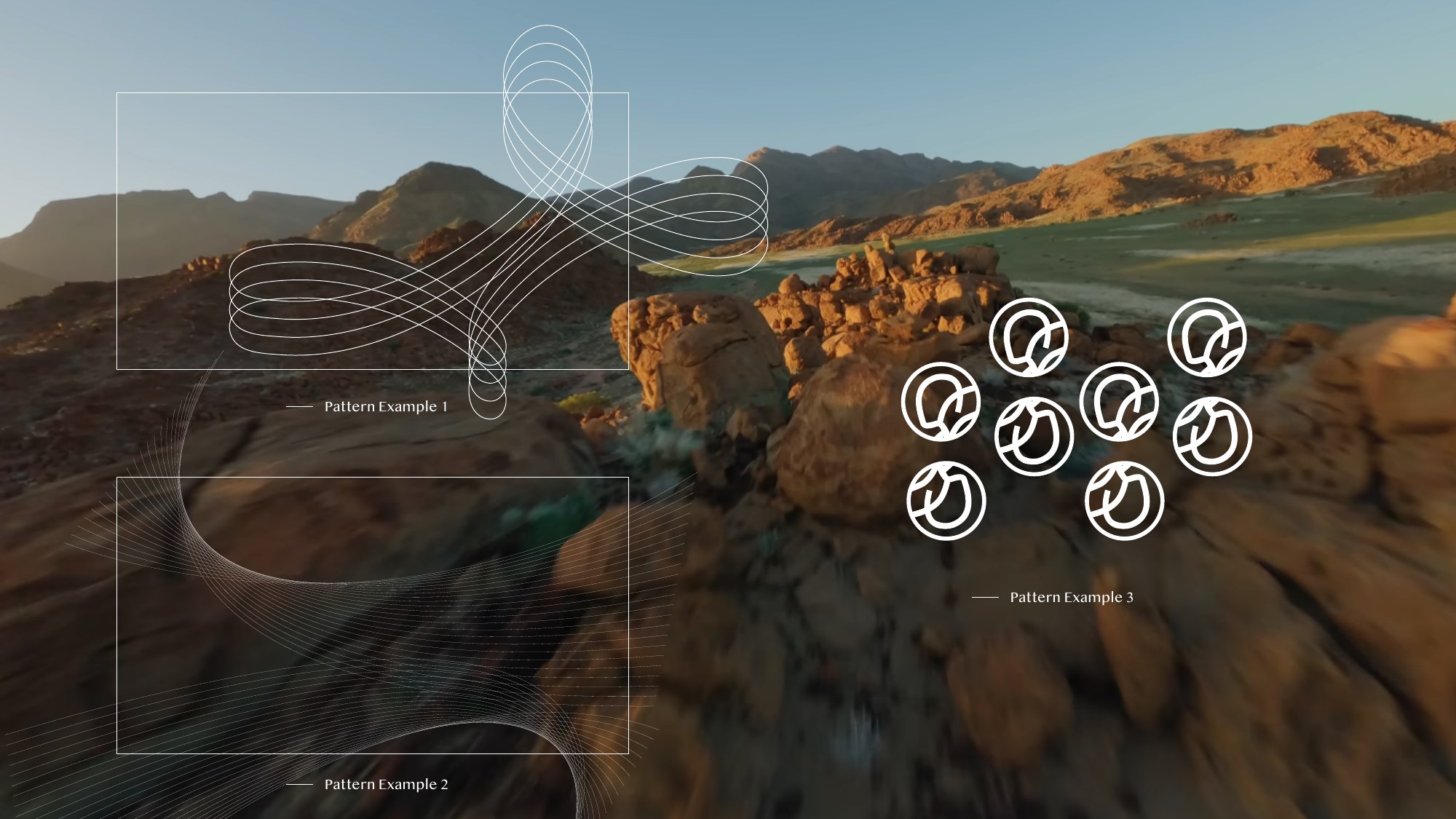
Looping bands extend the motion of the emblem into a wider graphic language. The proposal explores outlined ribbons, cropped curves and repeating motifs.
Deep navy, warm sand and white carry through the supplied presentation designs. Large patterned corners frame the content, while faint outlines provide a quieter background.

A system for
the next conversation.
The supplied presentation templates bring the identity into use: landscape-led opening slides, broad white content areas and the emblem placed in the corners.
The layouts range from bold photographic compositions to restrained frames, giving the proposed identity variety across a deck.




One identity.
Across every service.
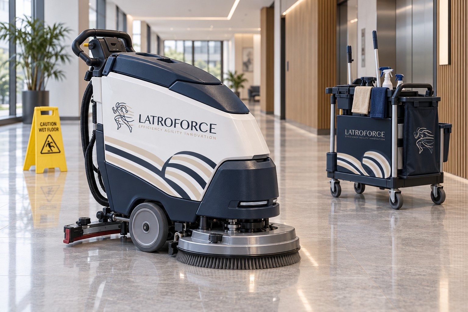
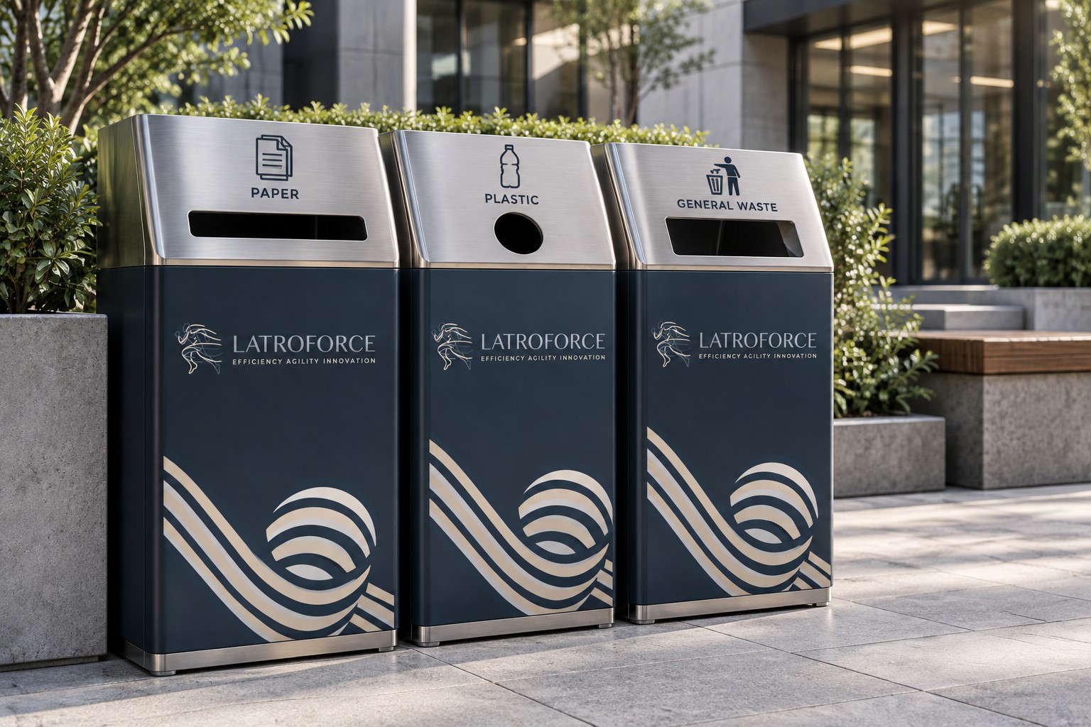
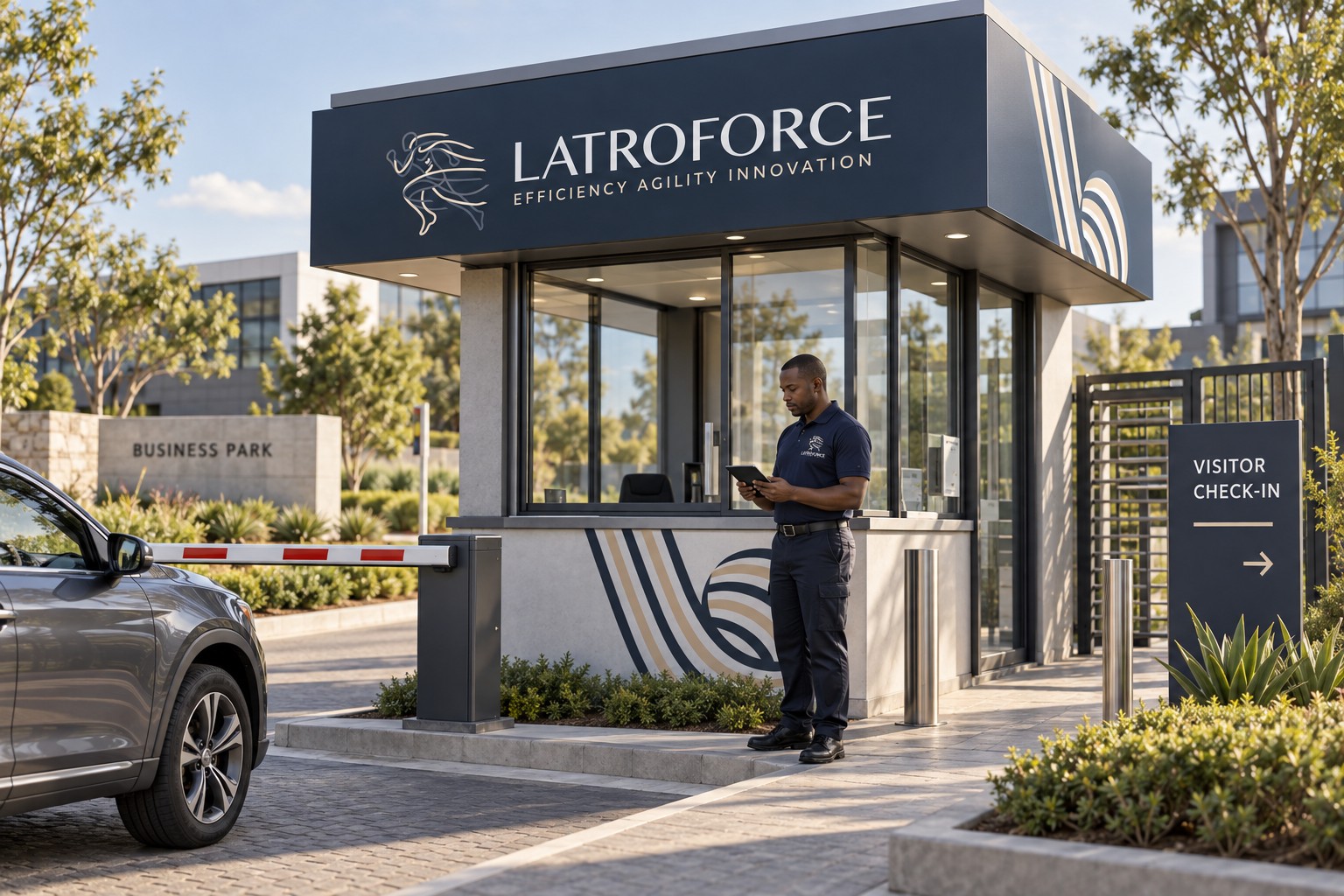
Four concept mockups explore how the proposed identity could appear in the places Latroforce works: on cleaning-team uniforms, cleaning equipment, waste-management stations and a staffed access point.
The uniform and equipment concepts bring the branding into day-to-day cleaning operations. Clearly labelled waste bins and a visitor check-in point extend it into waste management, gate management and staffed access services. Safe working and operational procedures sit alongside these services in Latroforce’s offering.

From the screen
to the desk.
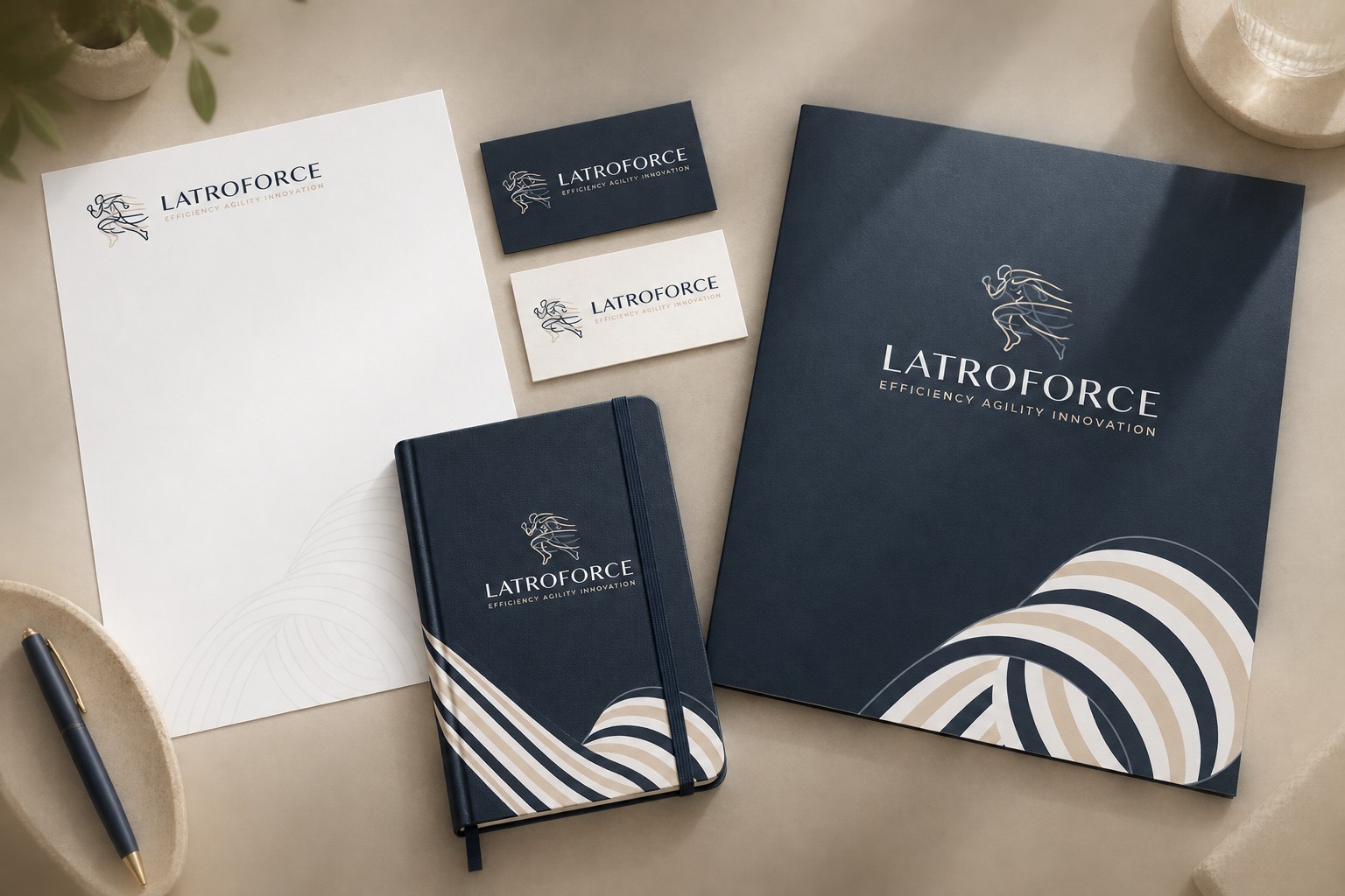
A stationery concept explores how the proposed mark and ribbon language could extend to letterhead, cards, a folder and a notebook. The supplied identity and presentation artwork provide the visual reference.
For facilities & management-services businesses
Can you refresh the brand of a cleaning, security or facilities business?
Yes. For Latroforce, which provides cleaning, waste management and access management services, we proposed a lighter, more modern identity while keeping its name and line.
Can you show us a rebrand before we commit?
Yes. We present a full proposal — logo options, pattern language, presentation templates and concept mockups — so you can judge the direction before anything changes. Latroforce is shown here as a proposal, not a completed rollout.
Can our brand work on uniforms, equipment and site signage?
Yes. We design for the places you work: team uniforms, equipment, waste stations and access points, visualised as concept mockups first.
Do you design presentation templates?
Yes. Branded presentation templates help your team pitch consistently; the Latroforce proposal includes a set of slide layouts. This proposal was developed in collaboration with LiteCharms.