Awethu Forestry
Rooted in nature.
Built on connection.
In collaboration with
A story of
shared growth.
The Awethu Forestry presentation centres on collaboration, sustainability and collective responsibility. It describes a brand whose story reaches beyond trees and timber to the people and partnerships connected to the land.
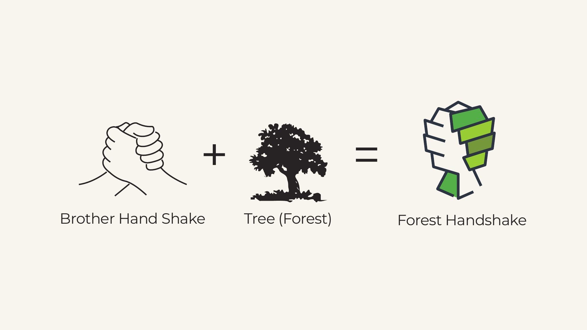
The identity concept brings that direction into a visual language: a handshake, a tree and an expressive palette drawn from nature.
Partnership,
in every branch.
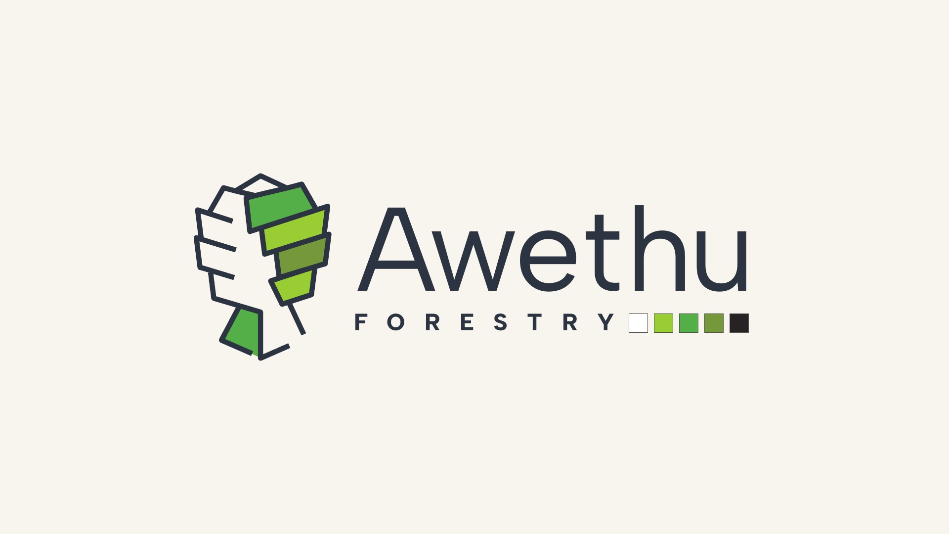
The symbol combines the gesture of a handshake with the shape of a tree. The tree expresses forestry and growth; the handshake introduces trust, unity and human connection.
Angular forms create a distinctive emblem that works alongside the Awethu wordmark or stands on its own.
Forest tones.
A brighter energy.
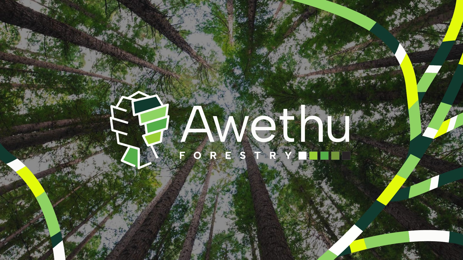
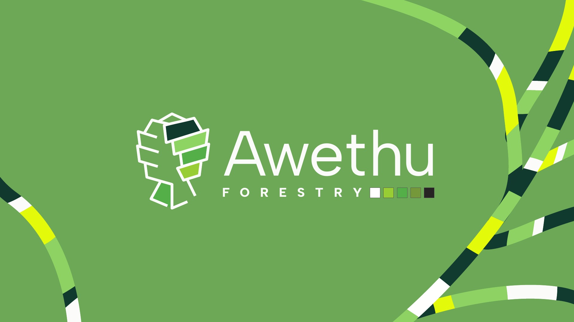
Deep greens, leafy tones and bright yellow-green accents give the identity both a natural foundation and a lively presence. Warm ivory provides space for the logo and typography.
Flowing graphic ribbons carry those colours across the presentation, framing photography and creating continuity between brand applications.
From the mark
to the everyday.
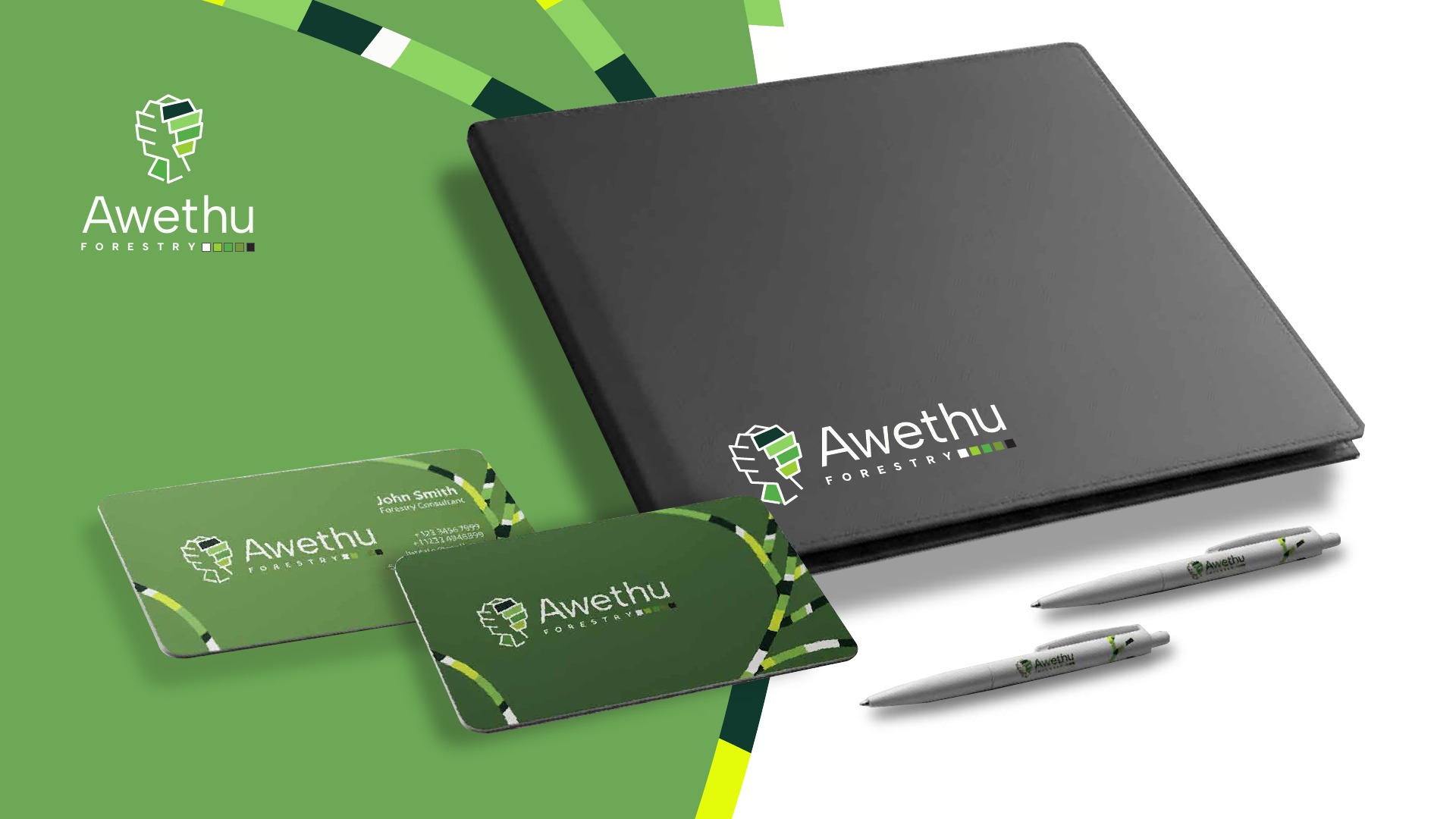
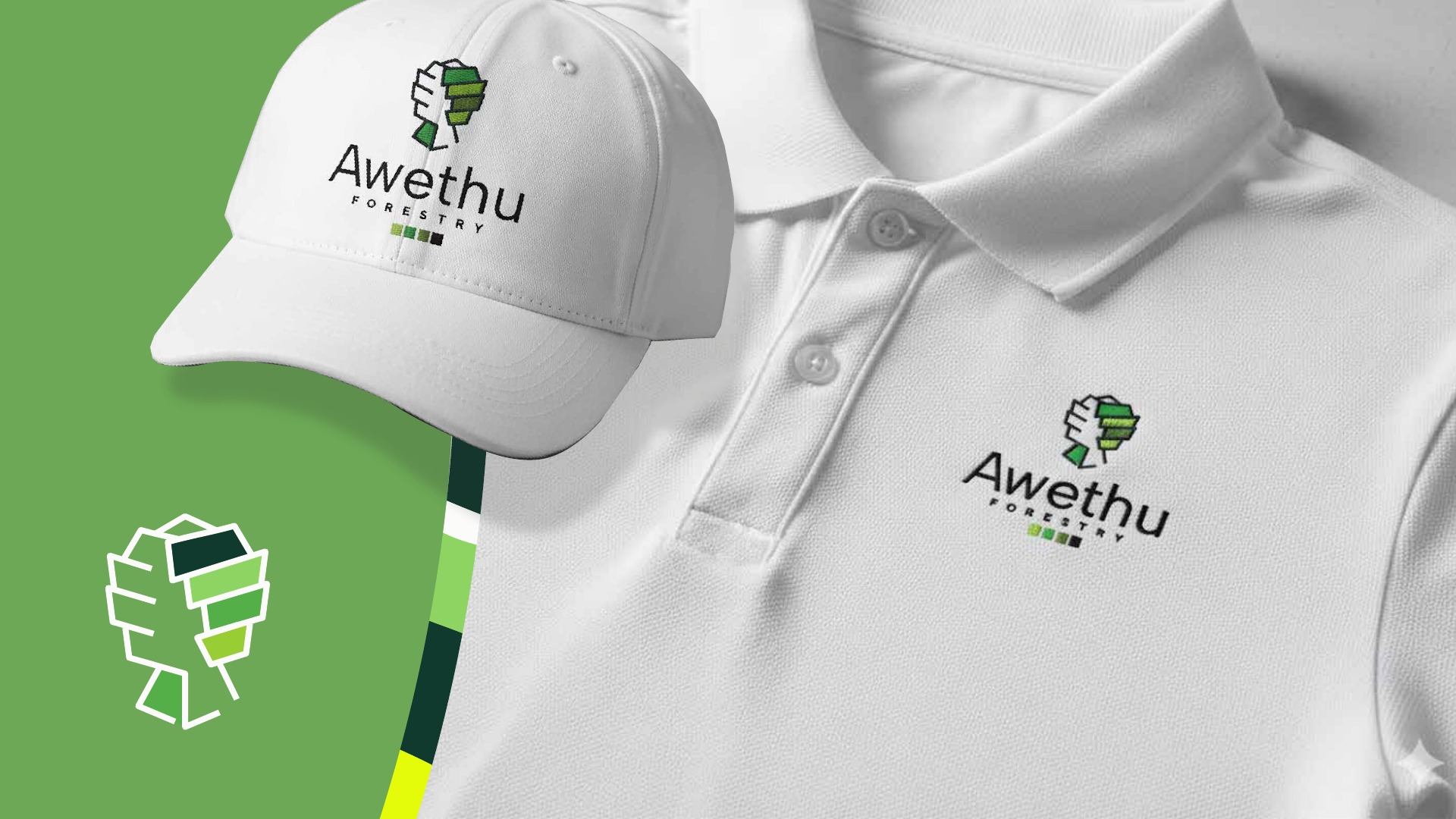
The presentation explores how the identity could extend across stationery and clothing. A notebook, cards and pens bring the system into printed materials; a cap and polo show the mark at a smaller, wearable scale.
A presence
in the landscape.
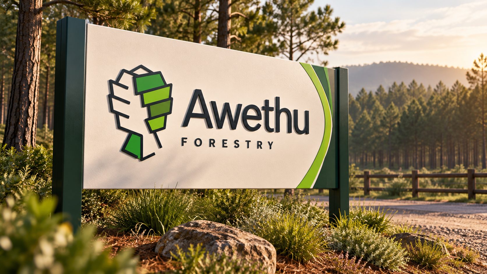
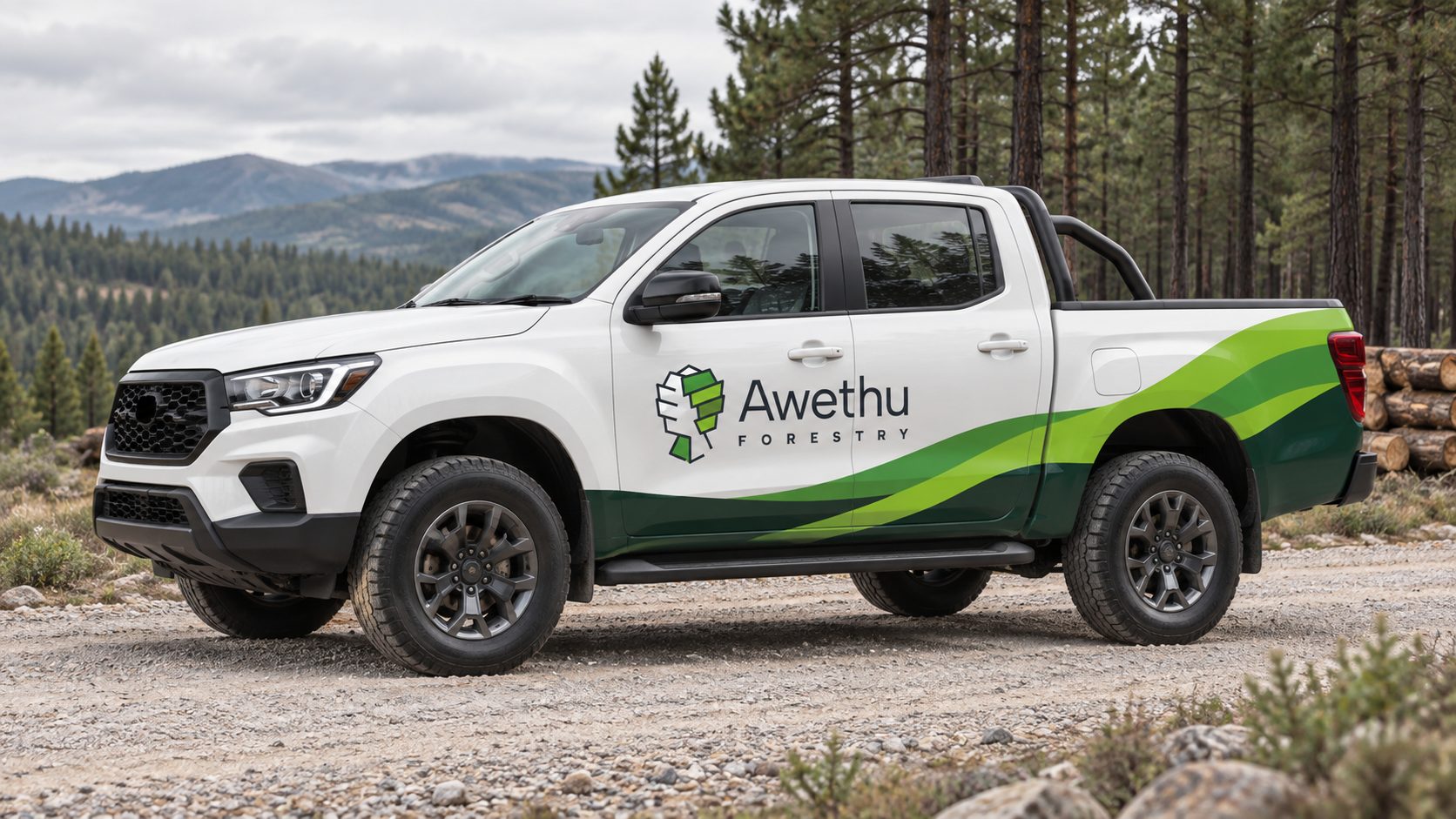
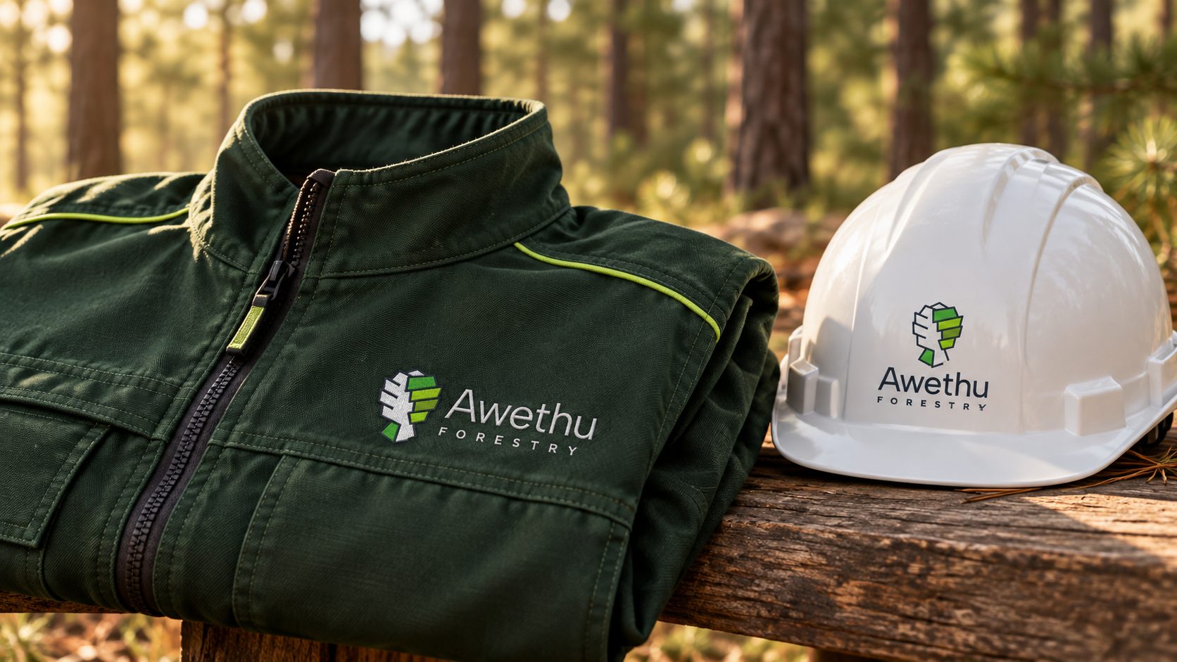
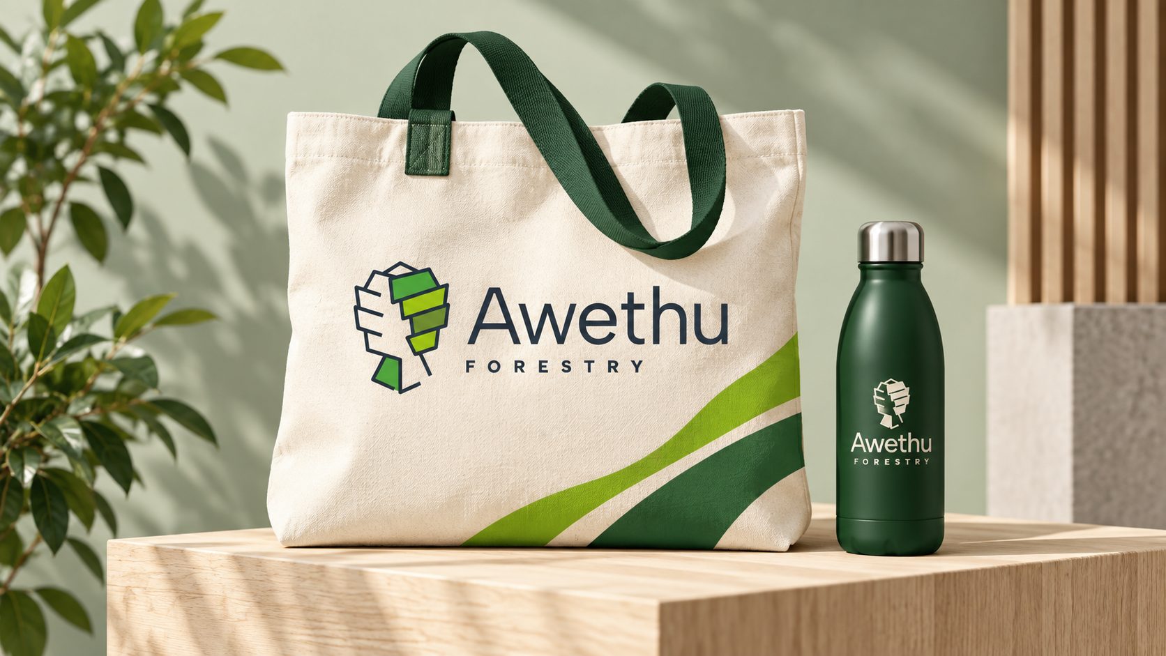
Further concepts explore the identity in the field: entrance signage, a forestry vehicle, workwear and a portable field kit.
From the forest.
To the screen.
The website brings Awethu’s identity into a digital setting. Forest imagery, the tree-and-handshake emblem and bright green accents connect the homepage to the wider brand system.
Clear routes to About, Impact, Services, Articles and Contact help visitors explore the business, its forestry services and its latest stories.
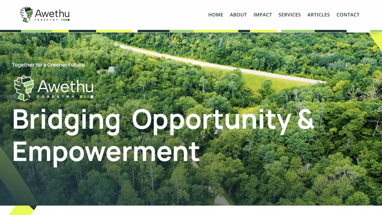
Live website · homepage · September 2026
For forestry, agriculture & land businesses
Can you create a brand for a forestry or land-based business?
Yes. We build identities that tell the story behind the work — for Awethu Forestry, a tree and handshake emblem expresses both forestry and partnership, carried through a palette drawn from nature.
Can you design both our brand and our website?
Yes. For Awethu we delivered the brand identity and the live website, with clear routes to the business’s services, impact and stories. We design, build and can host and maintain the site afterwards.
Can our brand work in the field as well as the office?
We design identities that hold up on signage, vehicles, workwear and field kit as well as print and screens, and show them to you as concept mockups first.
Do you work with forestry and agriculture businesses outside Johannesburg?
Yes. We are based in Johannesburg but remote-first, working with businesses across South Africa and beyond. Awethu Forestry was delivered in collaboration with LiteCharms.