Crow’s Nest
A place to land.
A feeling of home.
Coastal calm.
A warm welcome.
Crow’s Nest offers self-catering accommodation in Saldanha Bay. Its brand story centres on comfort, simplicity and a sense of home on the West Coast.
The identity translates that welcome into a recognisable emblem, a coastal palette and consistent materials for introducing the accommodation.
A crow.
A nest. A connection.
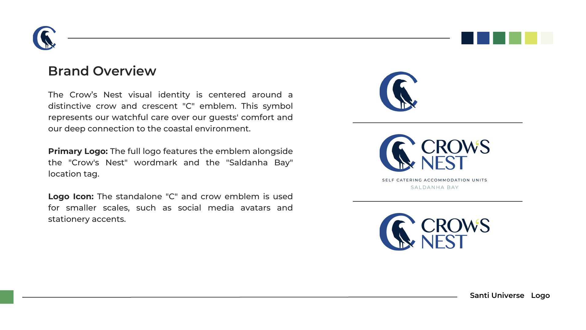
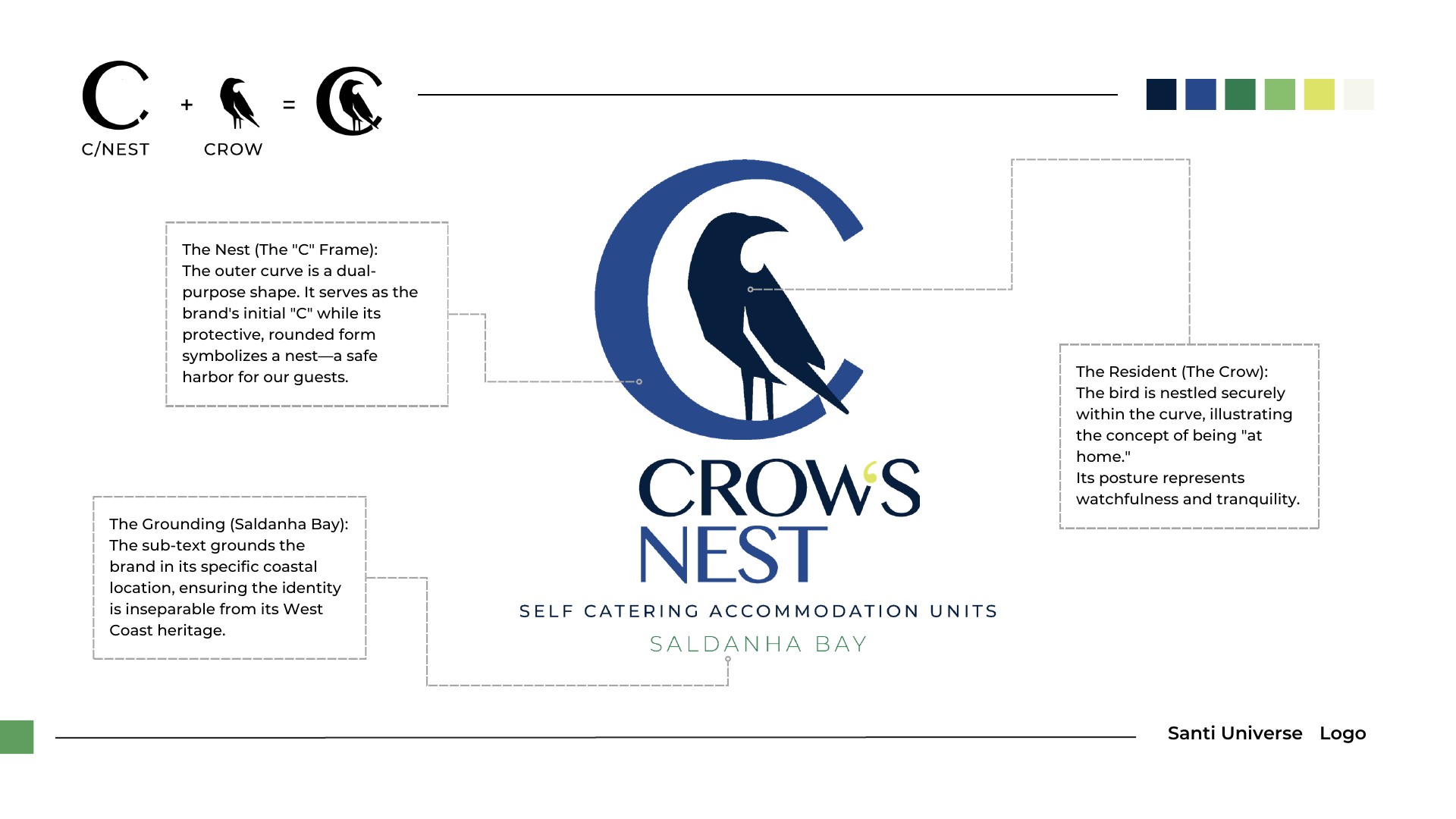
The curved “C” serves as both the brand’s initial and a protective frame around the crow. The guide connects this shape to a nest: a place of comfort and belonging.
The emblem works alone at smaller sizes, while the full wordmark and Saldanha Bay line establish the name and location.
Drawn from
the coast.
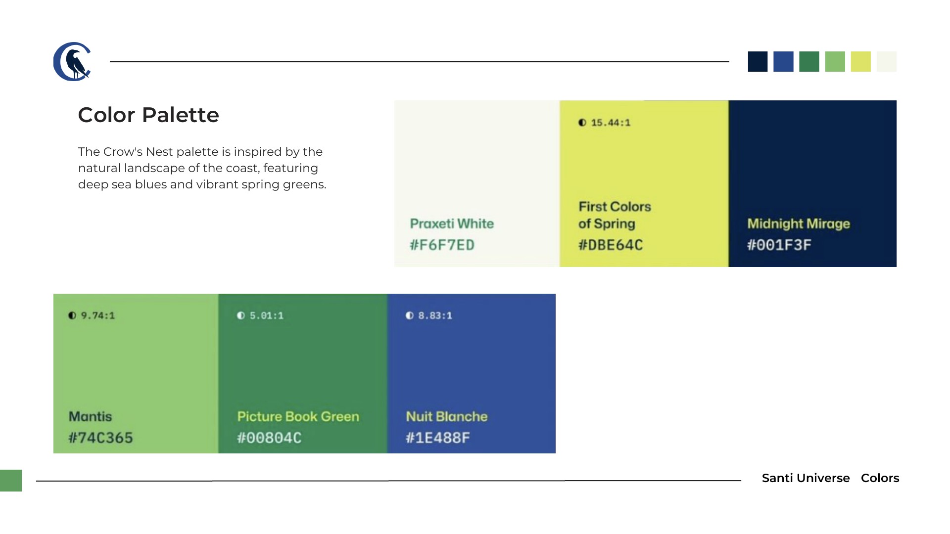
Deep sea blues anchor the identity. Greens and a yellow-green accent introduce freshness, while off-white gives the system a softer background.
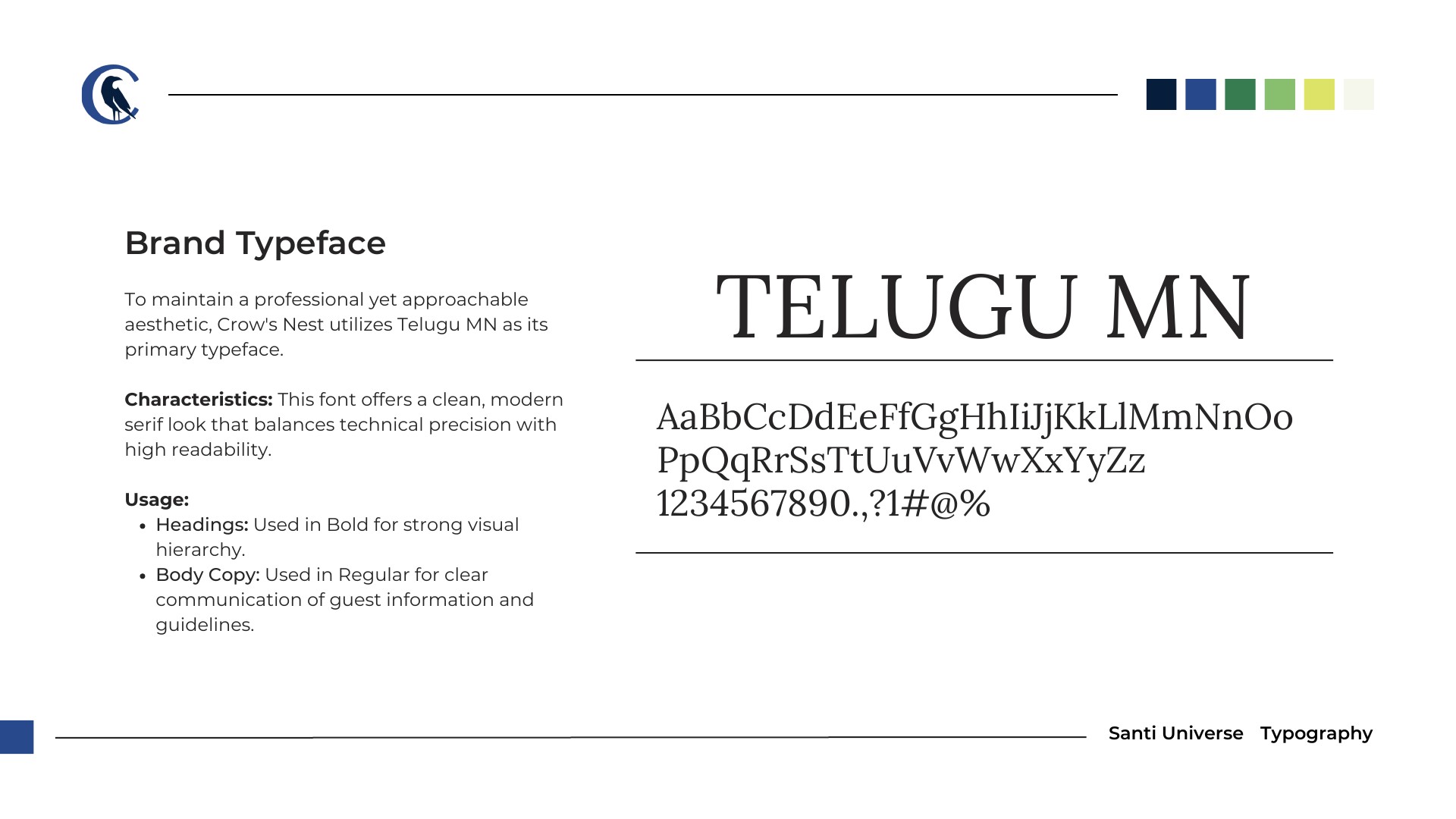
The guide specifies Telugu MN as the primary typeface. Its character complements the emblem and gives the brand a distinct voice across its communications.
- Midnight
#001F3F - Blue
#1E488F - Green
#00804C - Spring
#DBE64C - Off-white
#F6F7ED
An introduction
to the stay.
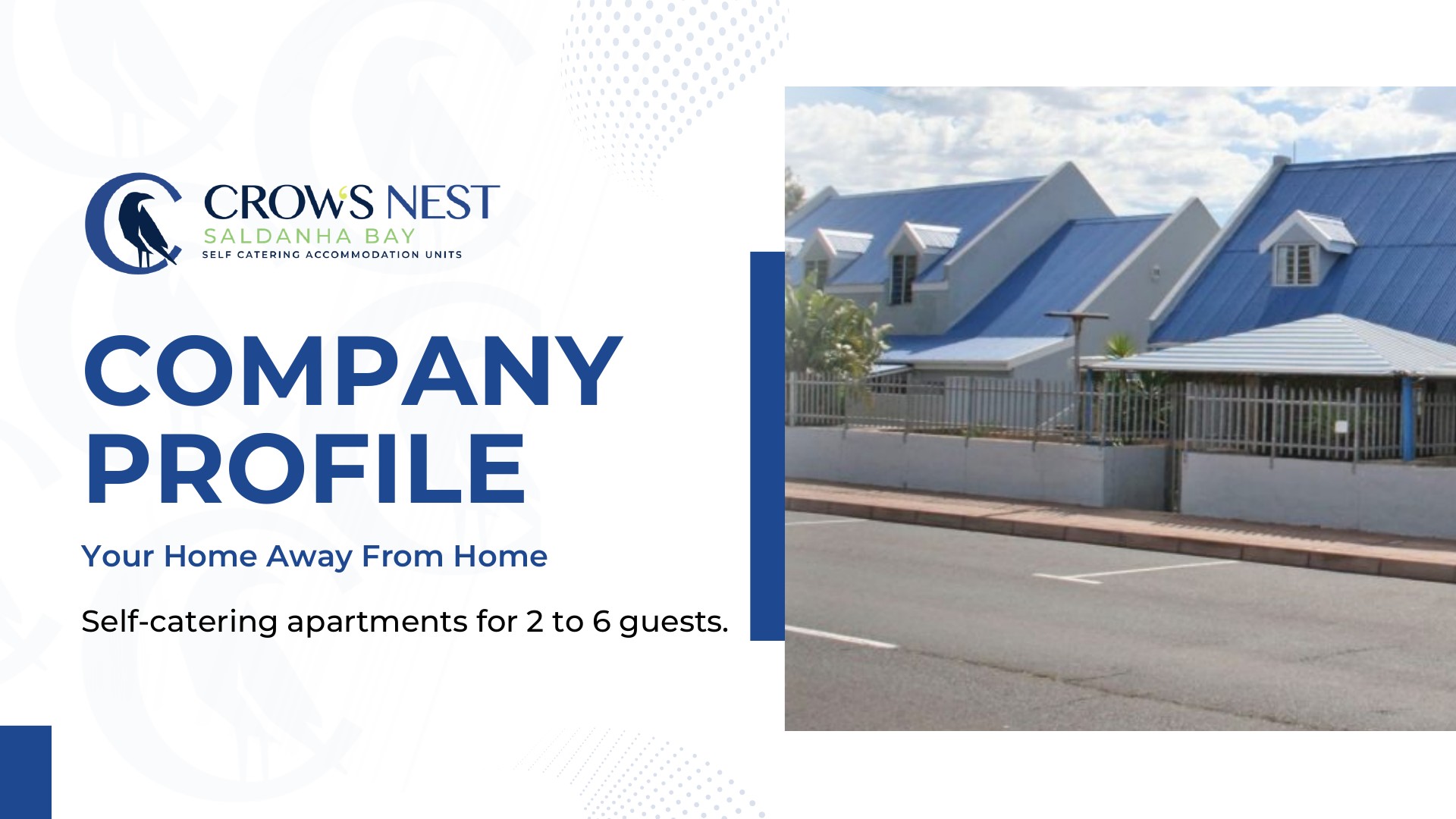
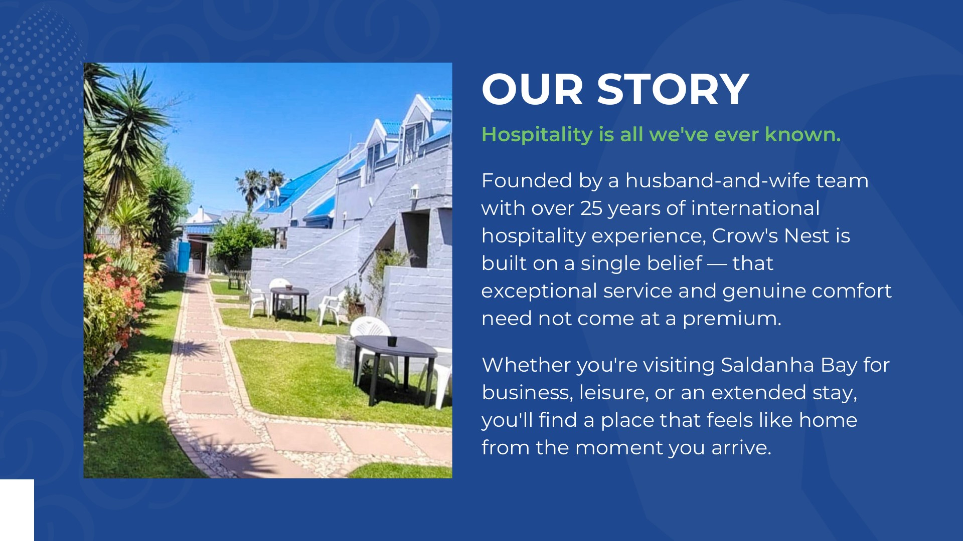
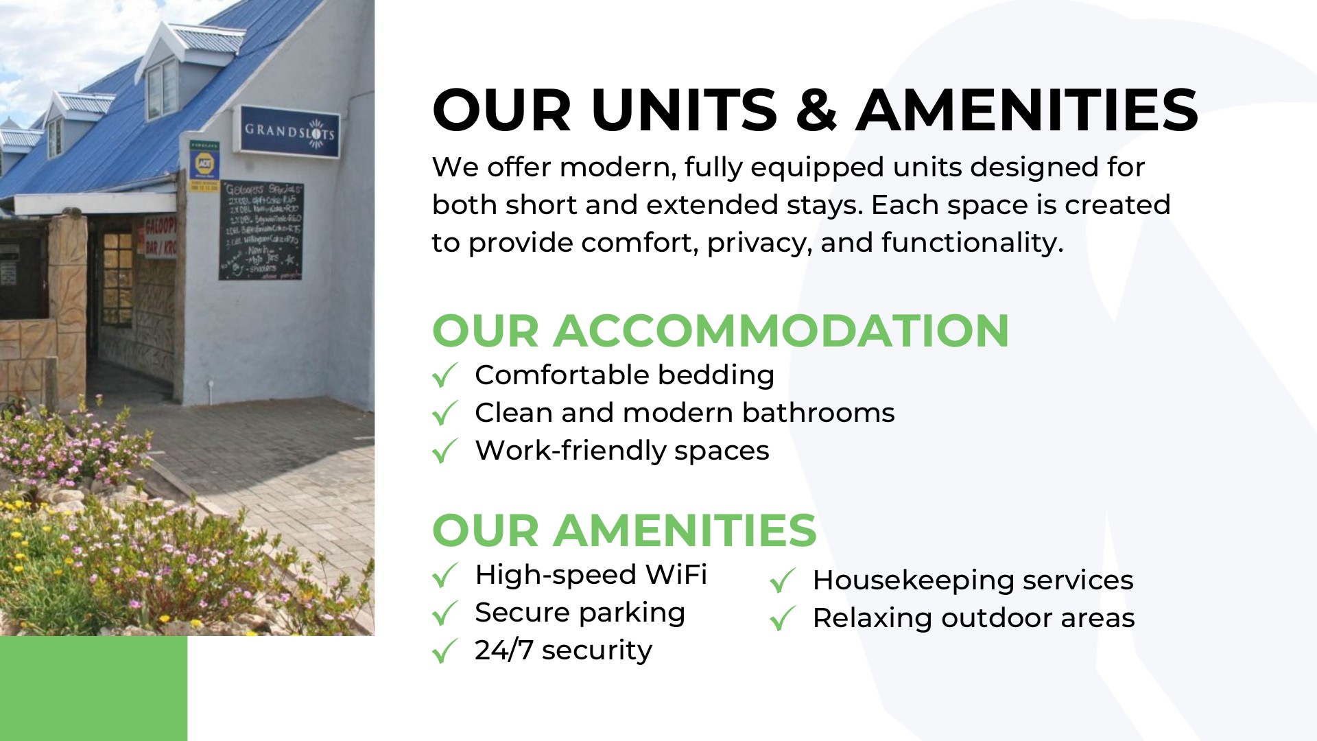
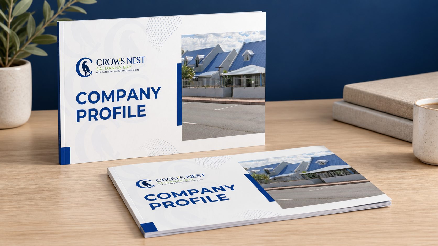
The company profile brings the identity together with photographs of the accommodation. The layout introduces the story, units and amenities through clear sections, generous imagery and the brand’s blue and green accents.
Explore the rooms.
Plan the stay.
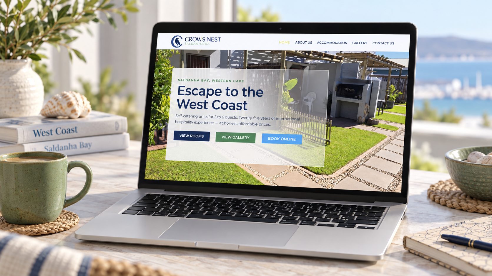
The live website carries the brand into the guest journey, pairing the crow emblem and coastal colours with photographs of the accommodation.
Visitors can explore room types, browse the gallery and follow the booking links. The homepage gives those actions a clear place alongside the property’s story.
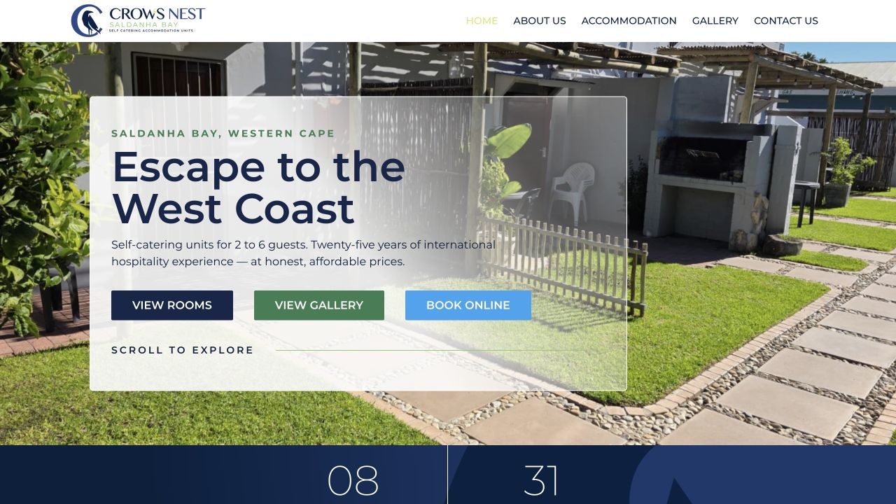
Live website · September 2026
Thoughtful details.
A familiar welcome.
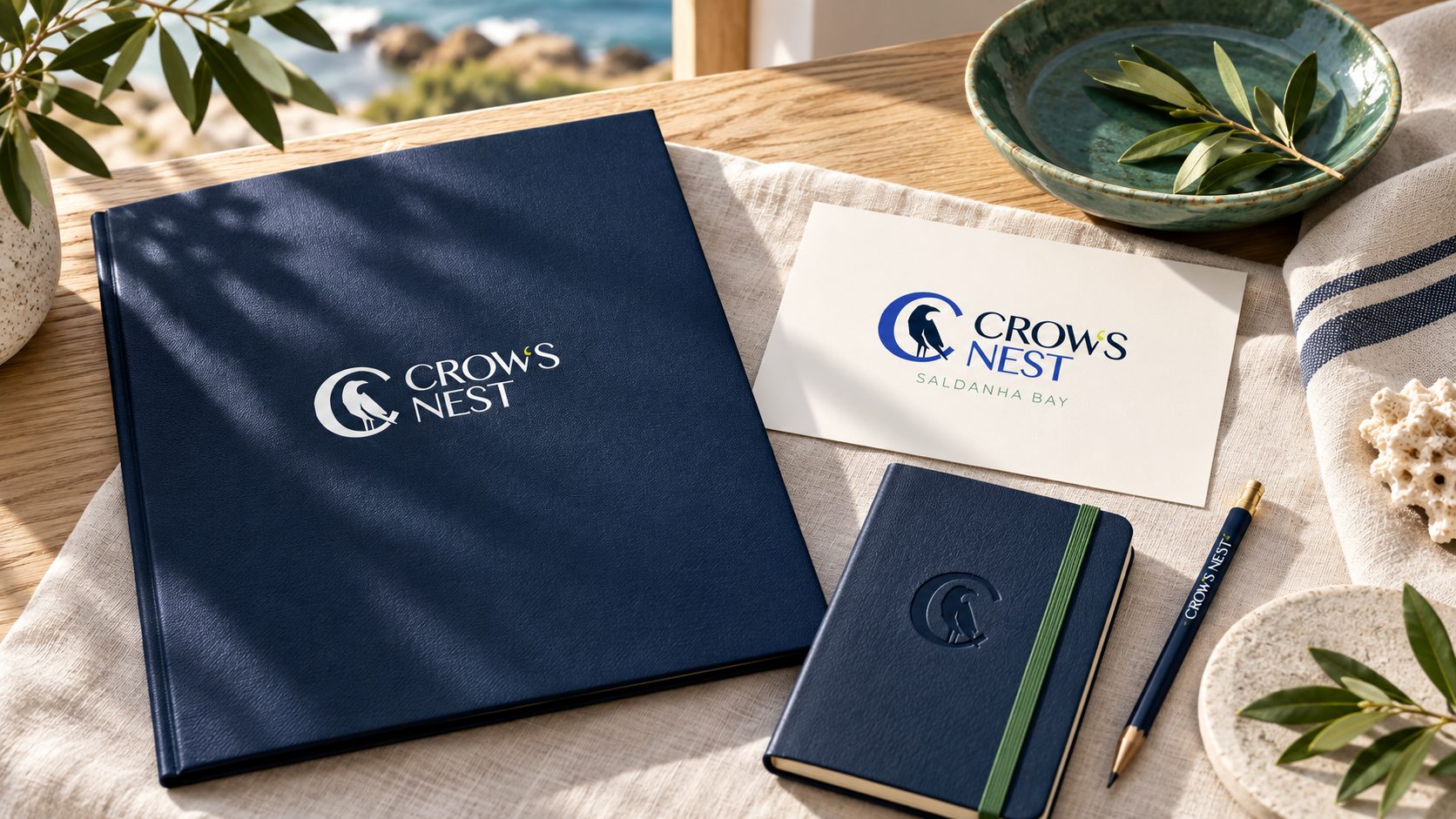
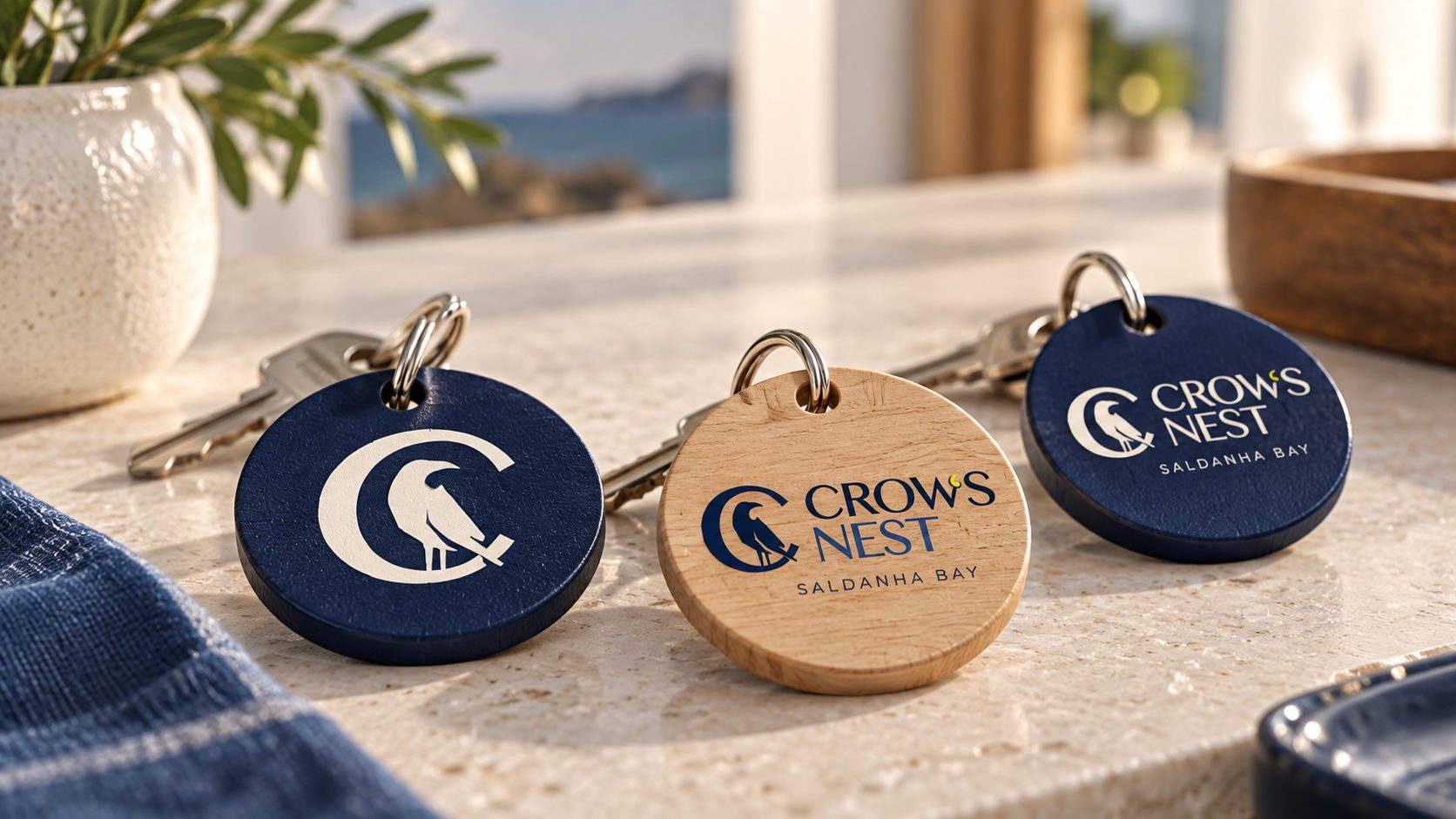
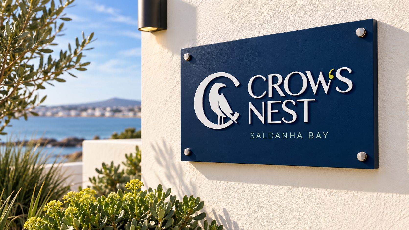
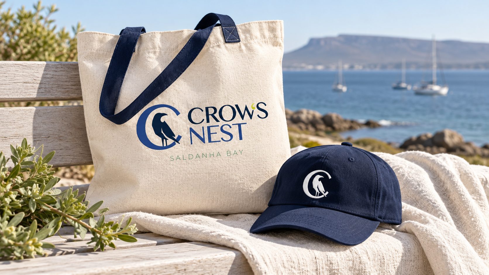
Six concept mockups explore the identity across welcome stationery, room keys, signage, merchandise, a company-profile booklet and a laptop website presentation.
For guesthouses & self-catering accommodation
Can Santi Universe design a brand and website for my guesthouse?
Yes. For Crow’s Nest, self-catering accommodation in Saldanha Bay, we created the identity and a website where guests explore room types, browse the gallery and follow booking links.
Can my website take bookings?
We design websites that make booking easy to find. For direct bookings on a WordPress site, we offer custom WordPress development, including booking functionality.
Do you design printed material for accommodation businesses?
Yes — company profiles, welcome stationery, signage and merchandise, all consistent with your brand. We can show items like room keys and signs as concept mockups first.
Can you host and look after my accommodation website?
Yes. We offer managed hosting with SSL, automated backups, speed optimisation, uptime monitoring and ongoing maintenance.