Slice Republic
A slice of character.
A touch of royalty.
A pizzeria identity exploration, from a crowned slice to the details of a takeaway experience.
In collaboration with
Handcrafted flavour.
A distinctive mark.
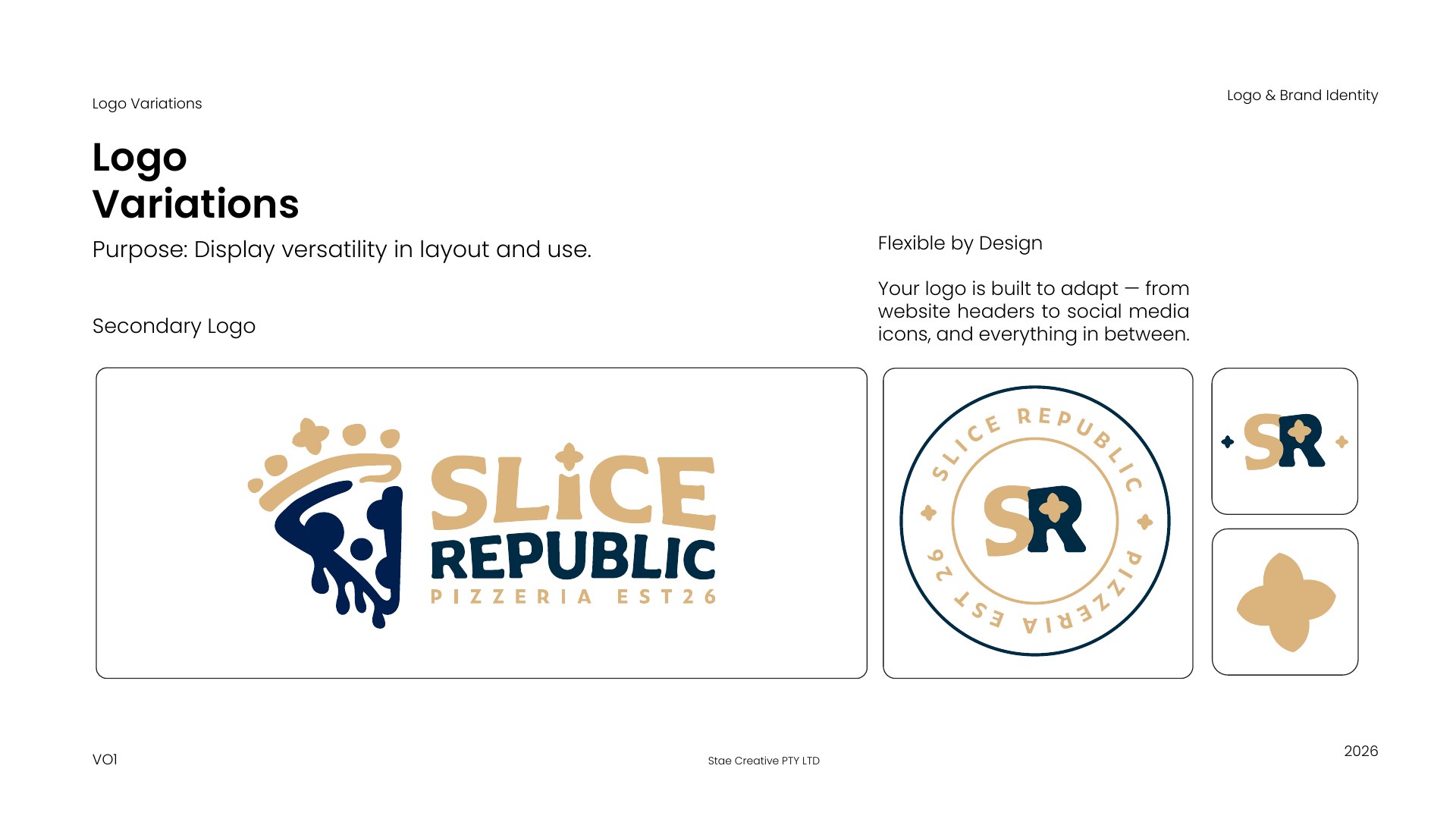
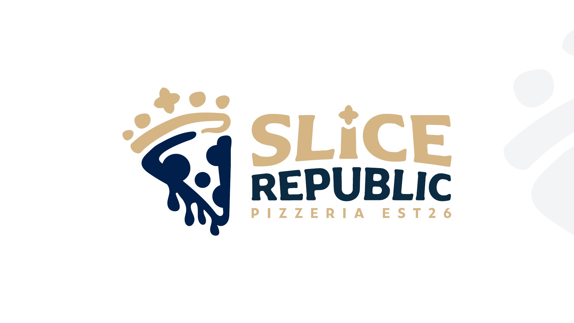
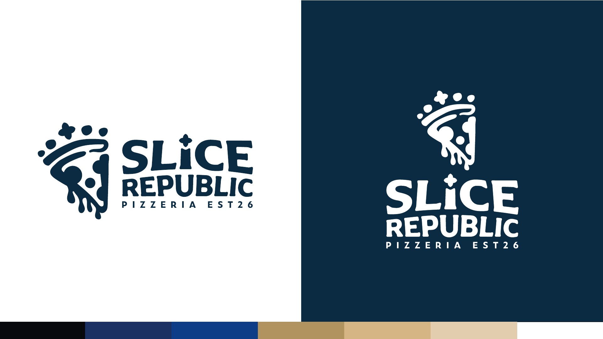
The Slice Republic identity pairs an expressive pizza-slice emblem with a crown. The supplied guide connects the flowing forms to handcrafted pizza and the crown to a premium, welcoming experience.
Navy, gold and warm cream carry that idea across the wordmark, supporting marks and proposed brand applications.
Two directions.
One personality.
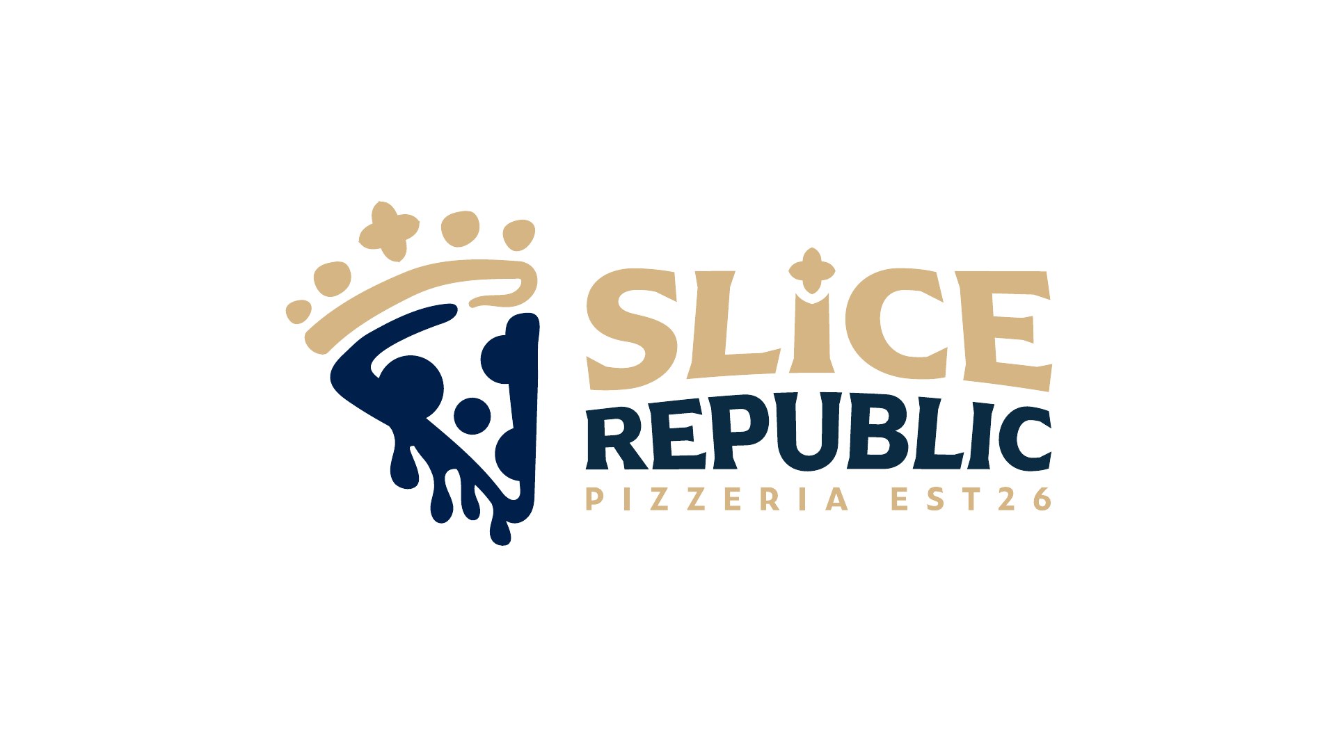
The second-draft presentation explores two wordmark treatments, labelled “Curves” and “Sharp Sharp”. Both retain the crowned slice, with differences in the letterforms giving each direction its own character.
Presented here as design development; the supplied documents do not establish which direction received final approval.
Deep blues.
Warm accents.
The guide specifies deep navy and royal blue alongside gold and cream. Light and dark logo treatments keep the identity recognisable across different backgrounds.
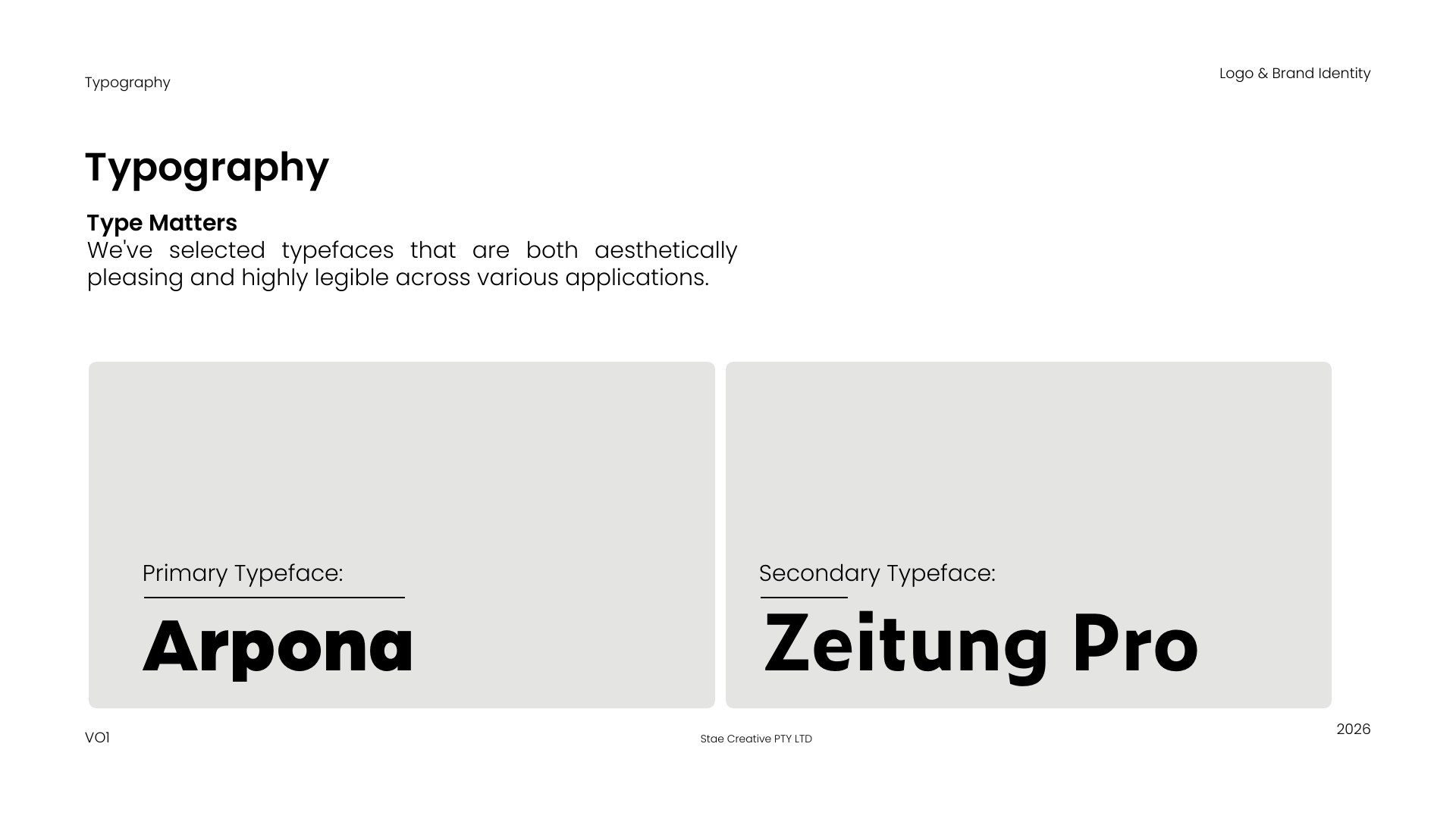
Arpona and Zeitung Pro are the typefaces named in the supplied identity guide.
- Deep navy
#153067 - Royal blue
#003B8B - Gold
#B49255 - Cream
#E5CCAA
From the counter
to the takeaway.
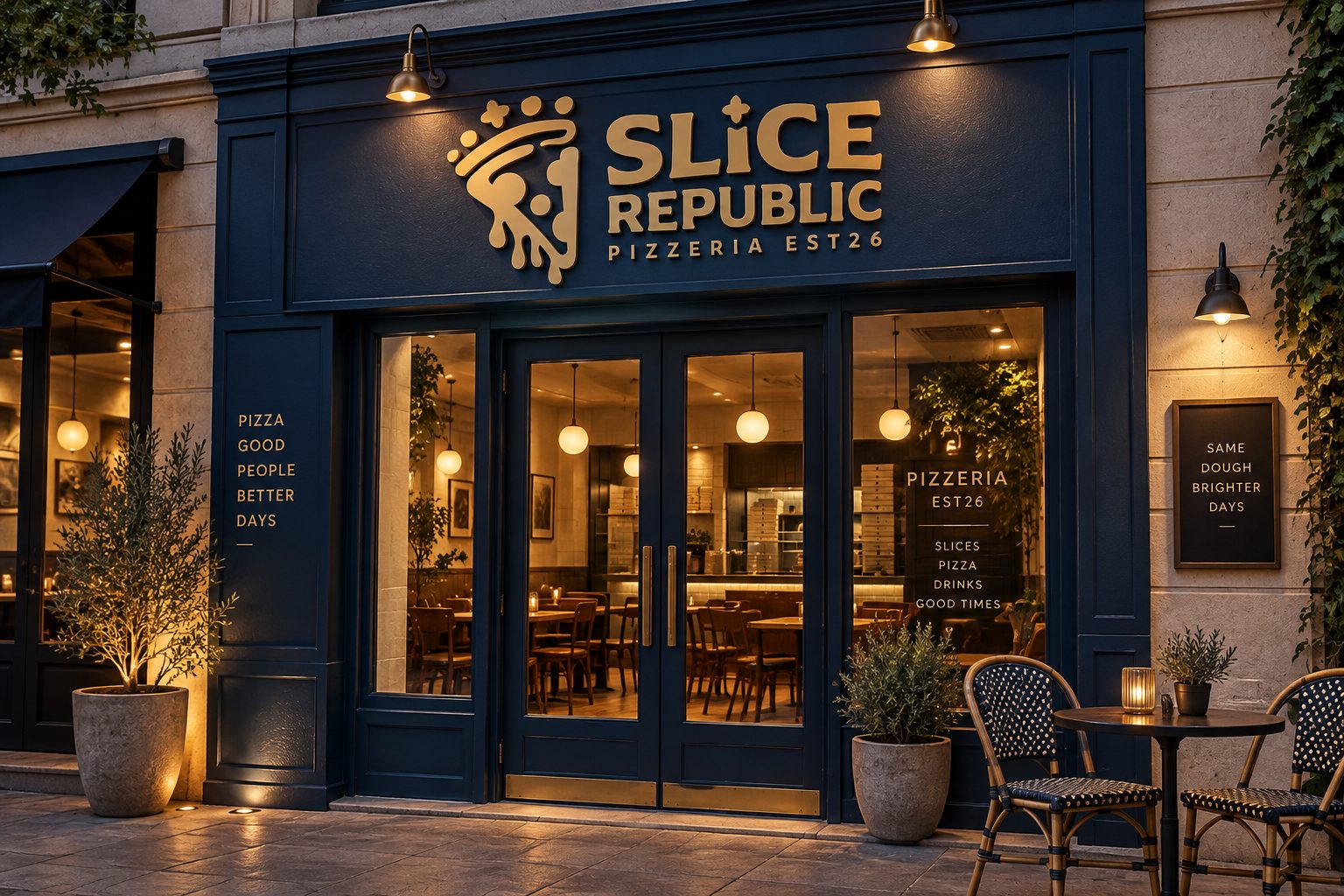
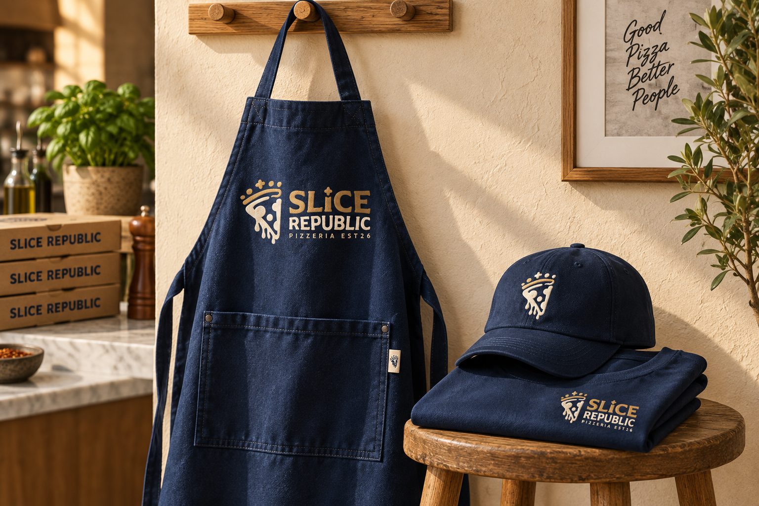
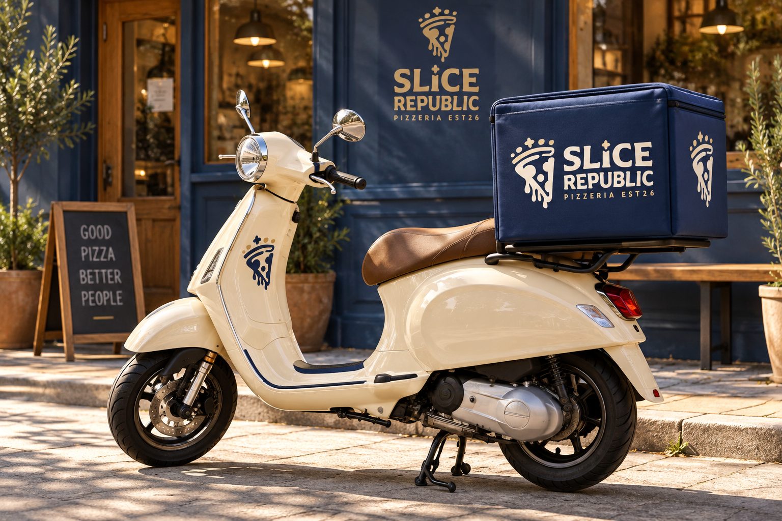
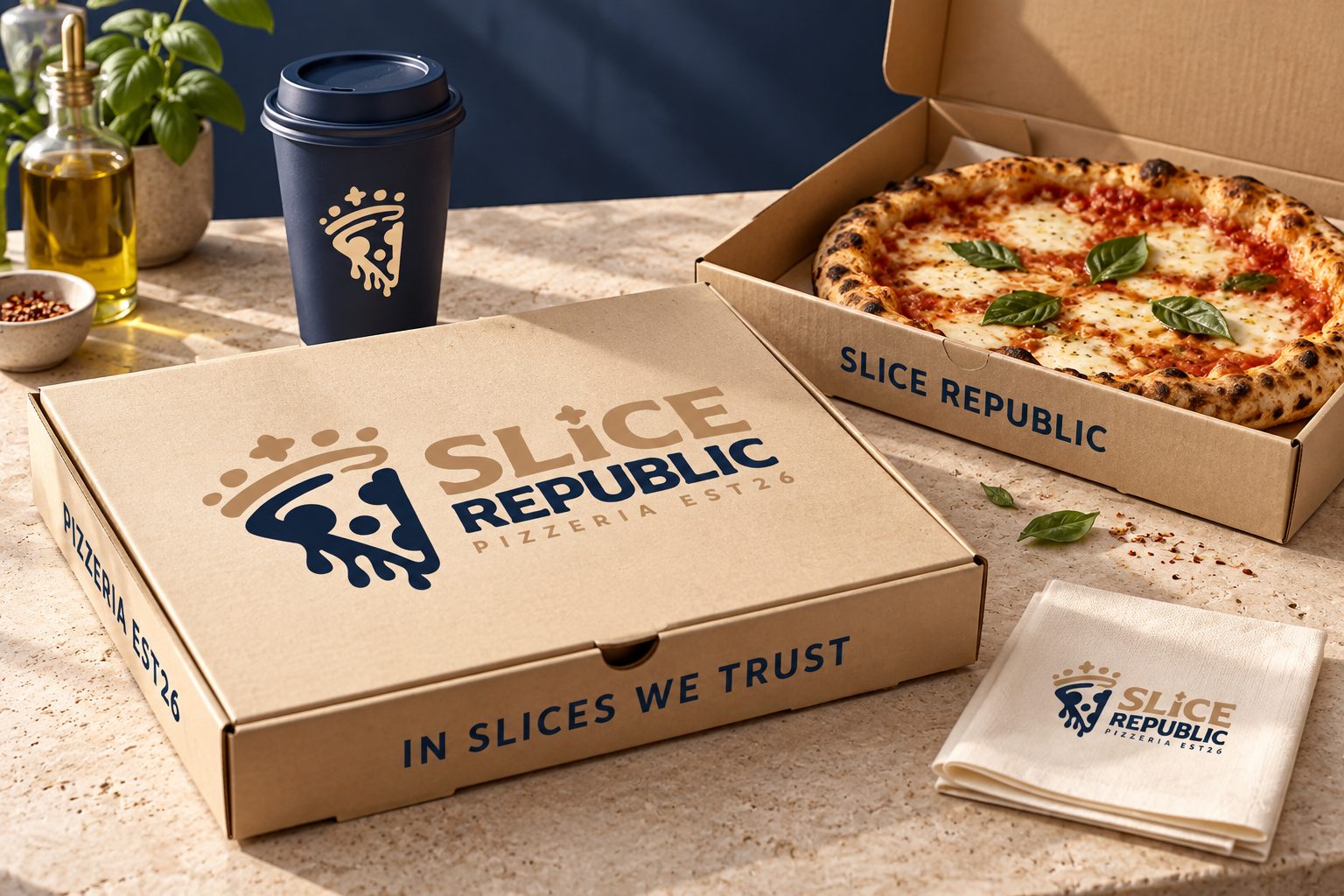
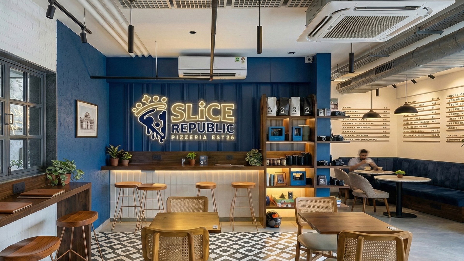
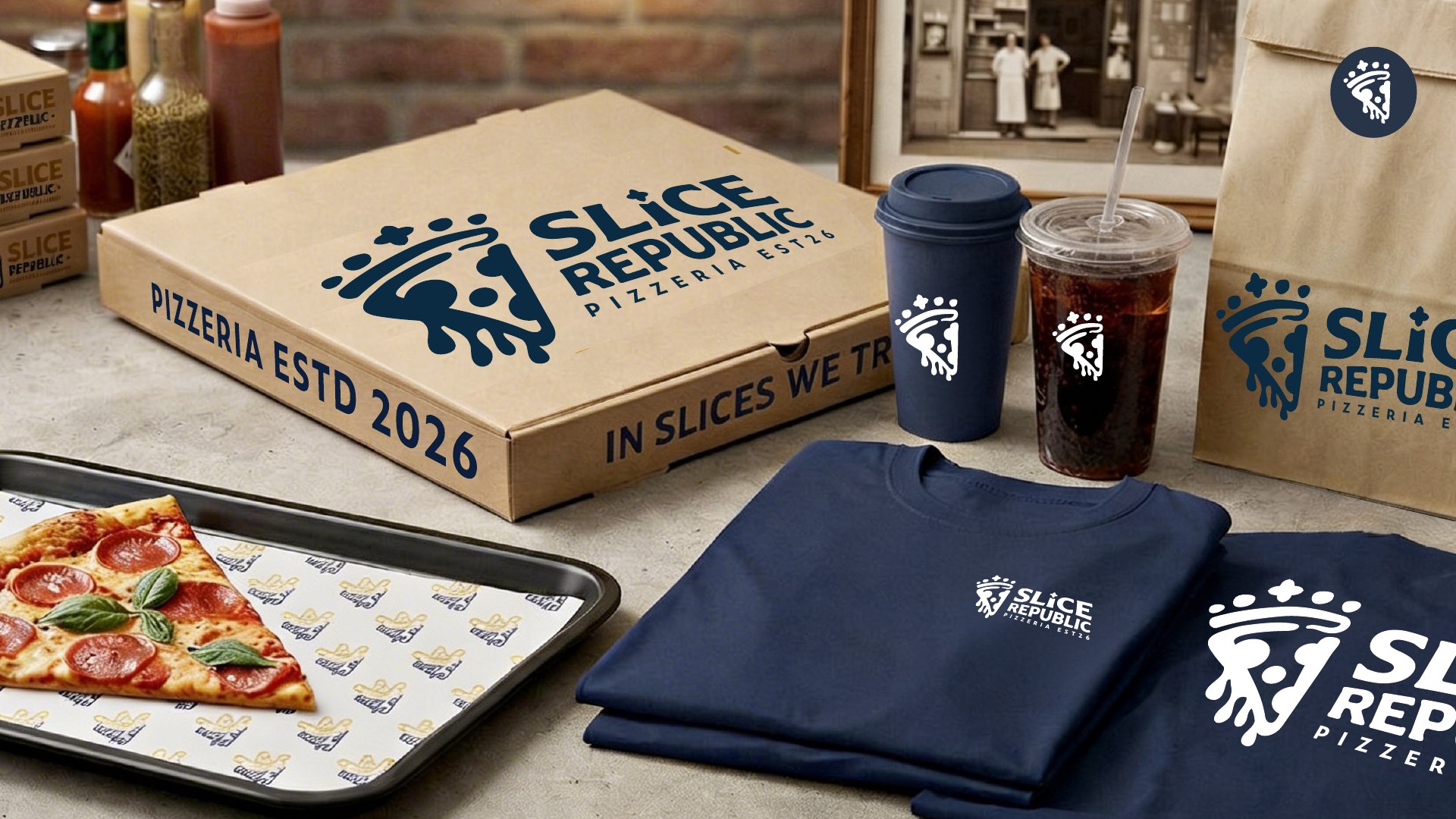
The supplied mockups explore how the identity could appear in a pizzeria interior and on pizza boxes, drinks, bags and apparel. Repeated colours and the crowned-slice mark connect the different touchpoints.
These supplied concept visualisations illustrate proposed applications, not completed installations or production photography.
More ways
to make an impression.
Four concept scenes extend the identity into pizza packaging, storefront signage, staff apparel and delivery. Navy, cream and gold connect each application to the crowned-slice mark.
These four AI-generated visualisations explore possible applications of the brand. They are concept mockups, not photographs of completed work.