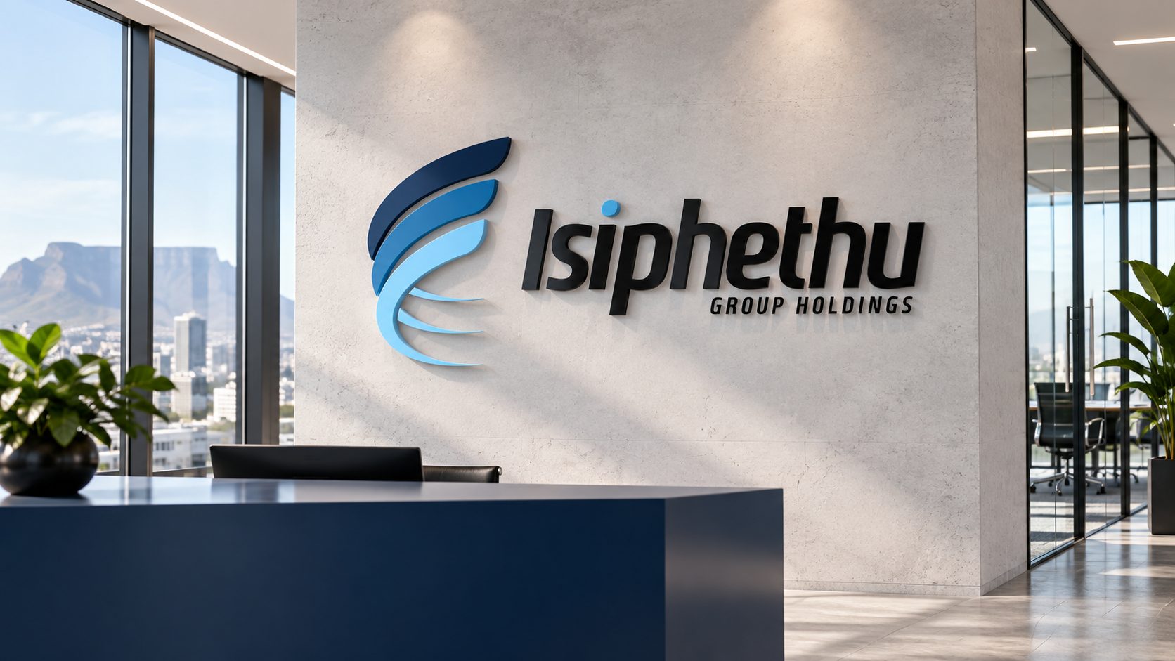
IsiphethuGroup Holdings
A consistent identity.
A confident presence.
One group.
A connected identity.
Isiphethu operates across construction, engineering and water services. Its identity needs to remain recognisable across corporate communications and practical, everyday applications.
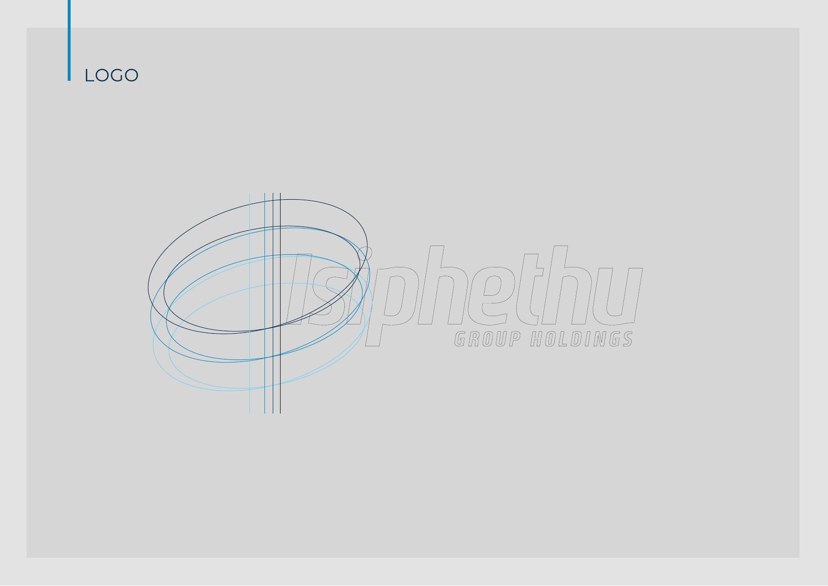
The brand guide brings the core elements together: logo construction, clear space, colour, typography and usage rules. The aim is a consistent presentation wherever the brand appears.
Precision in
every detail.
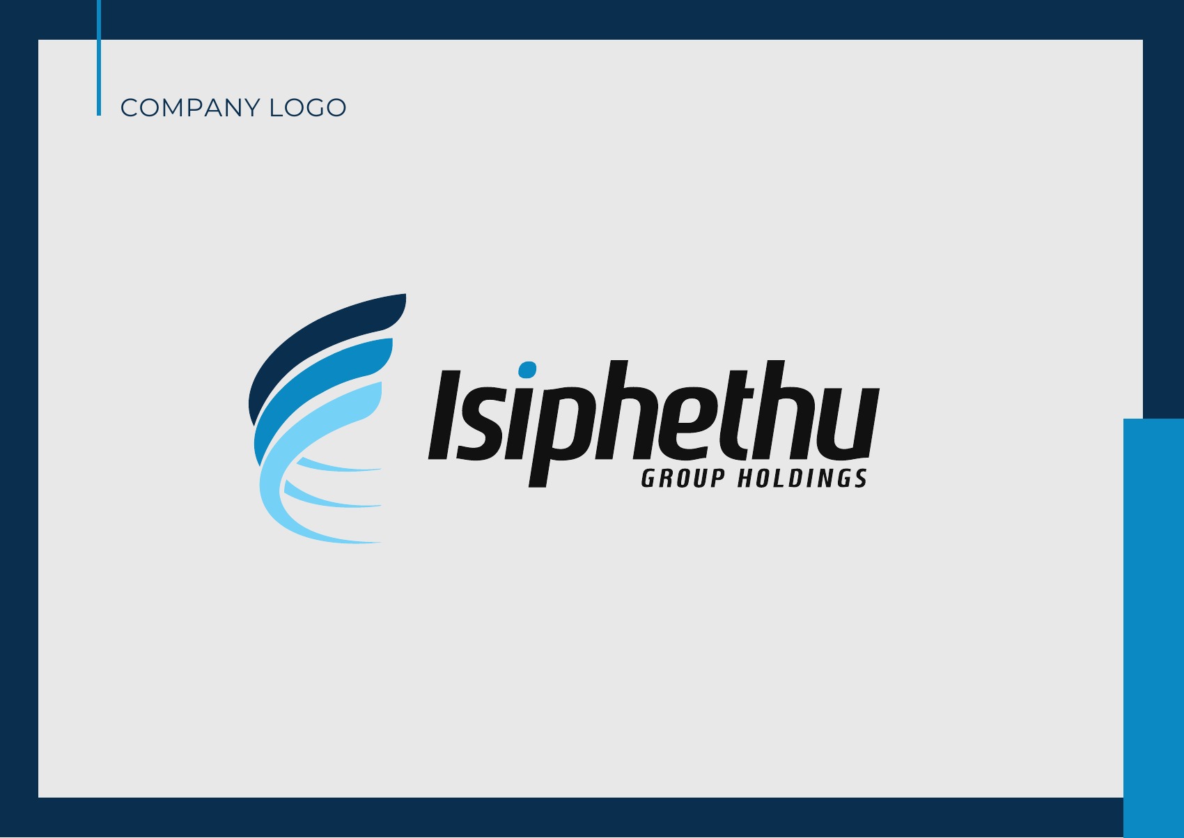
A flowing blue symbol sits beside a distinctive italic wordmark. The guide defines how that relationship is protected through consistent proportions, clear space and minimum sizes.
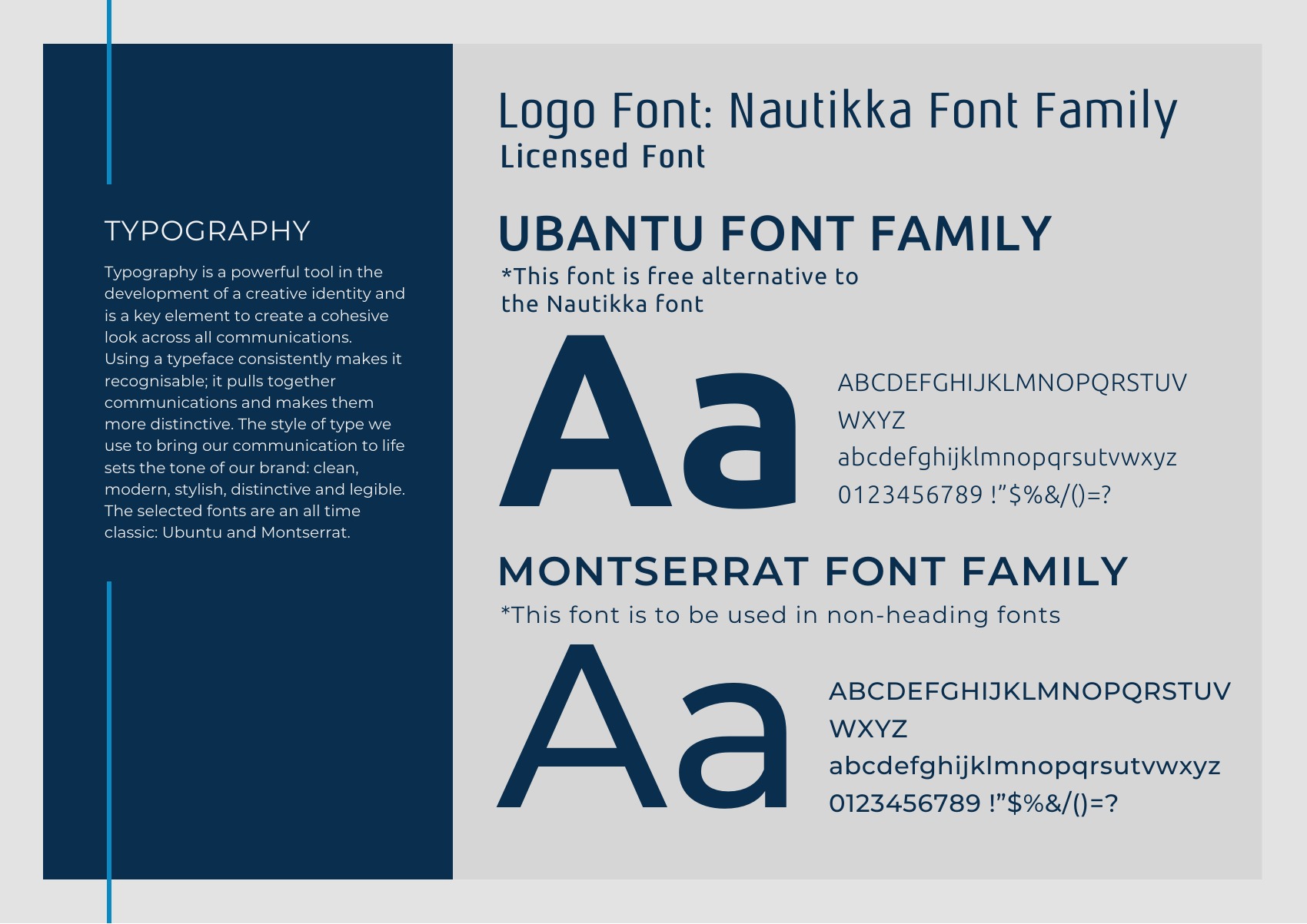
Navy provides depth, mid-blue carries the primary colour, and pale blue creates contrast. Ubuntu and Montserrat are named as supporting typefaces in the guide.
- Navy
#152D4B - Blue
#3E87BD - Pale blue
#8CCFF3 - Neutral
#F1F2F2
Clear. Considered.
Recognisably Isiphethu.
The guide sets out a direct, clear voice, supported by values including teamwork, integrity, knowledge, reliability and innovation.
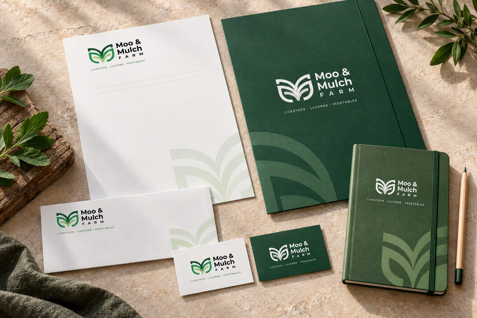
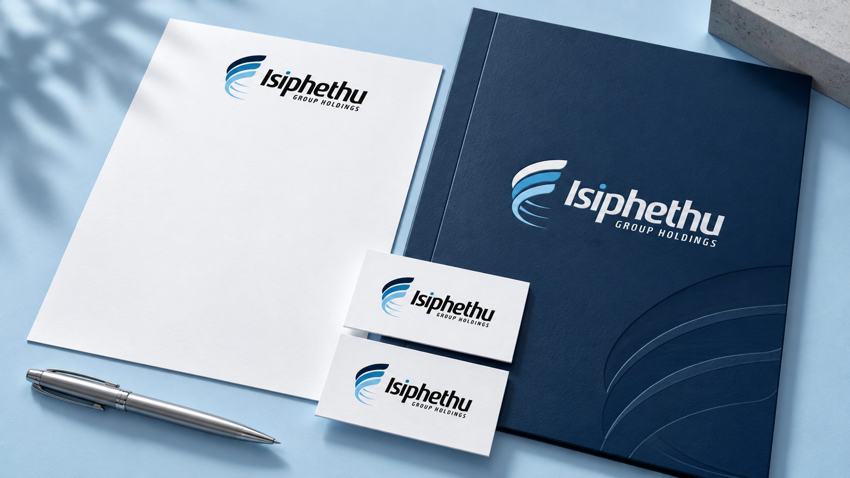
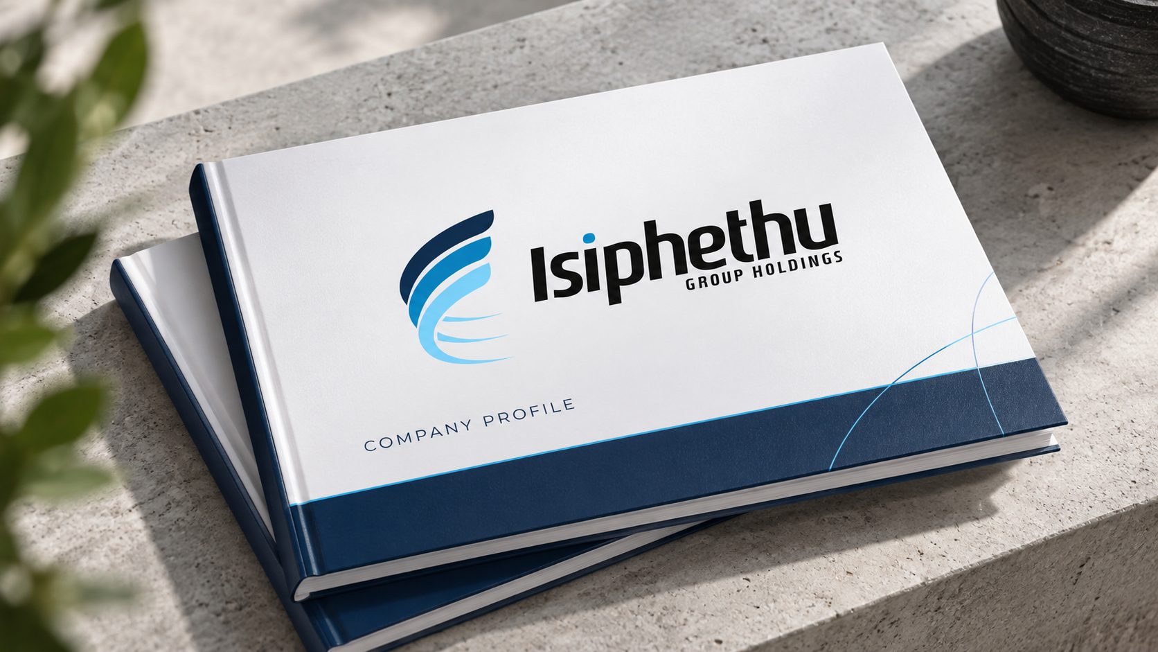
The stationery and company-profile concepts explore that identity in print, giving the logo room to stand out against clean surfaces and restrained blue details.
An identity
that travels.
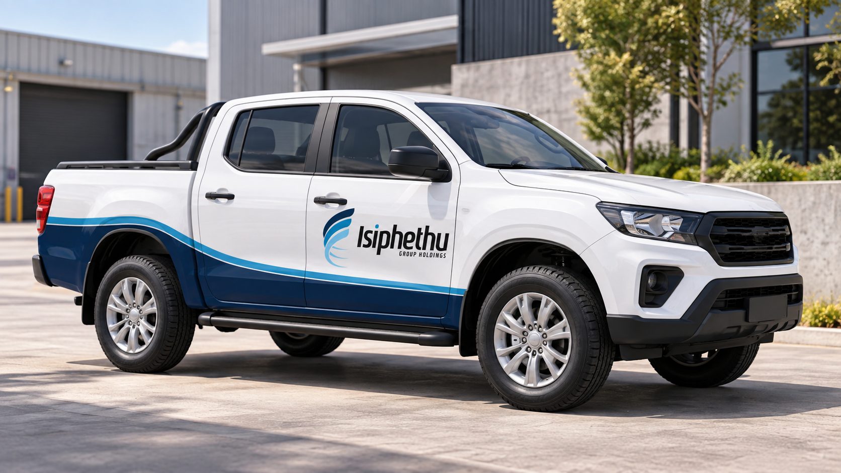
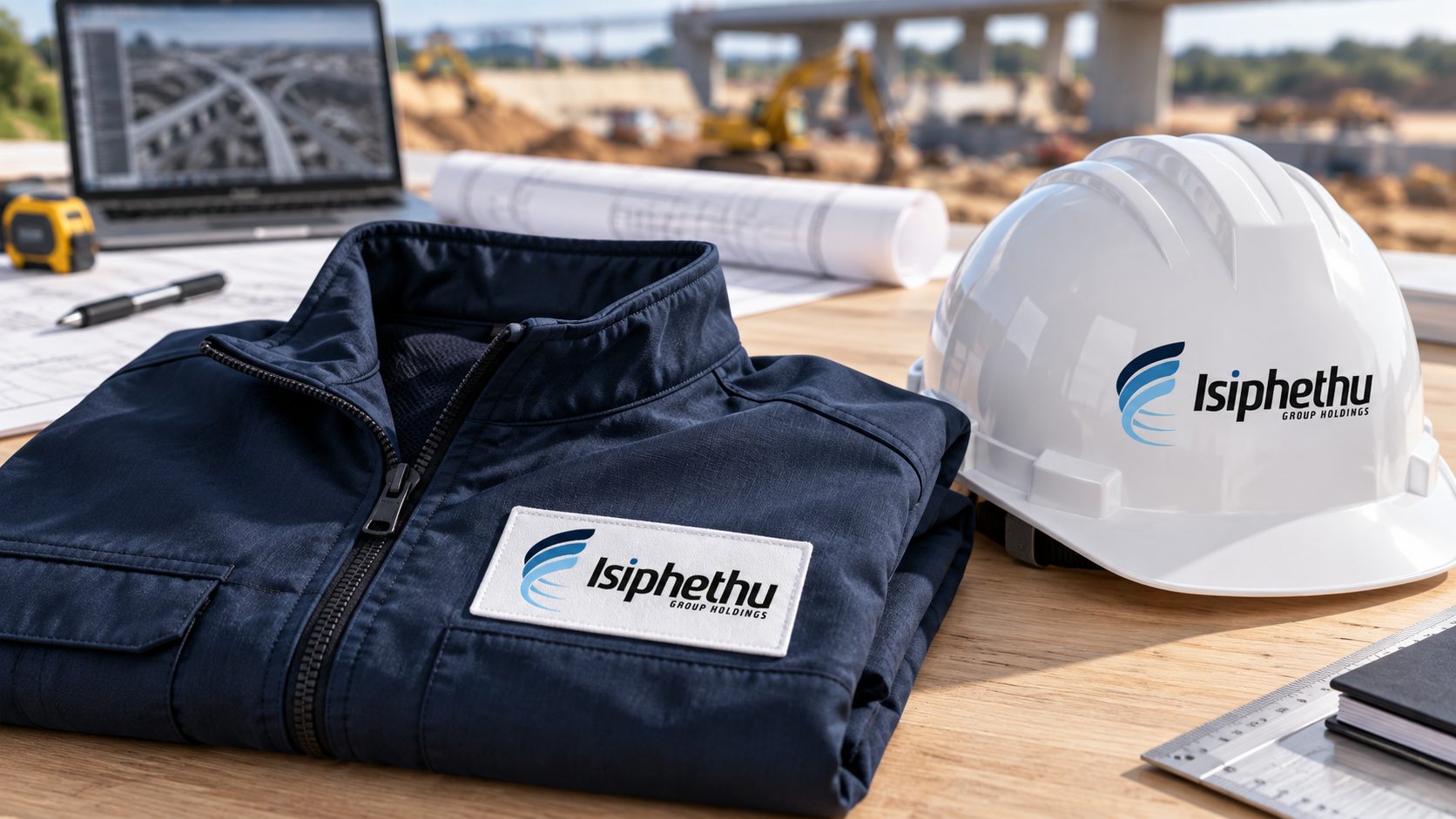
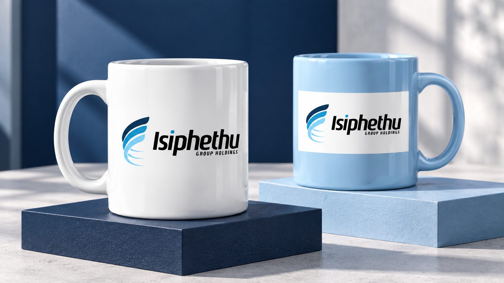
A vehicle, workwear and a ceramic mug extend the visual system into everyday contexts. Each application keeps the logo legible and the palette consistent.
Related services.
A shared foundation.
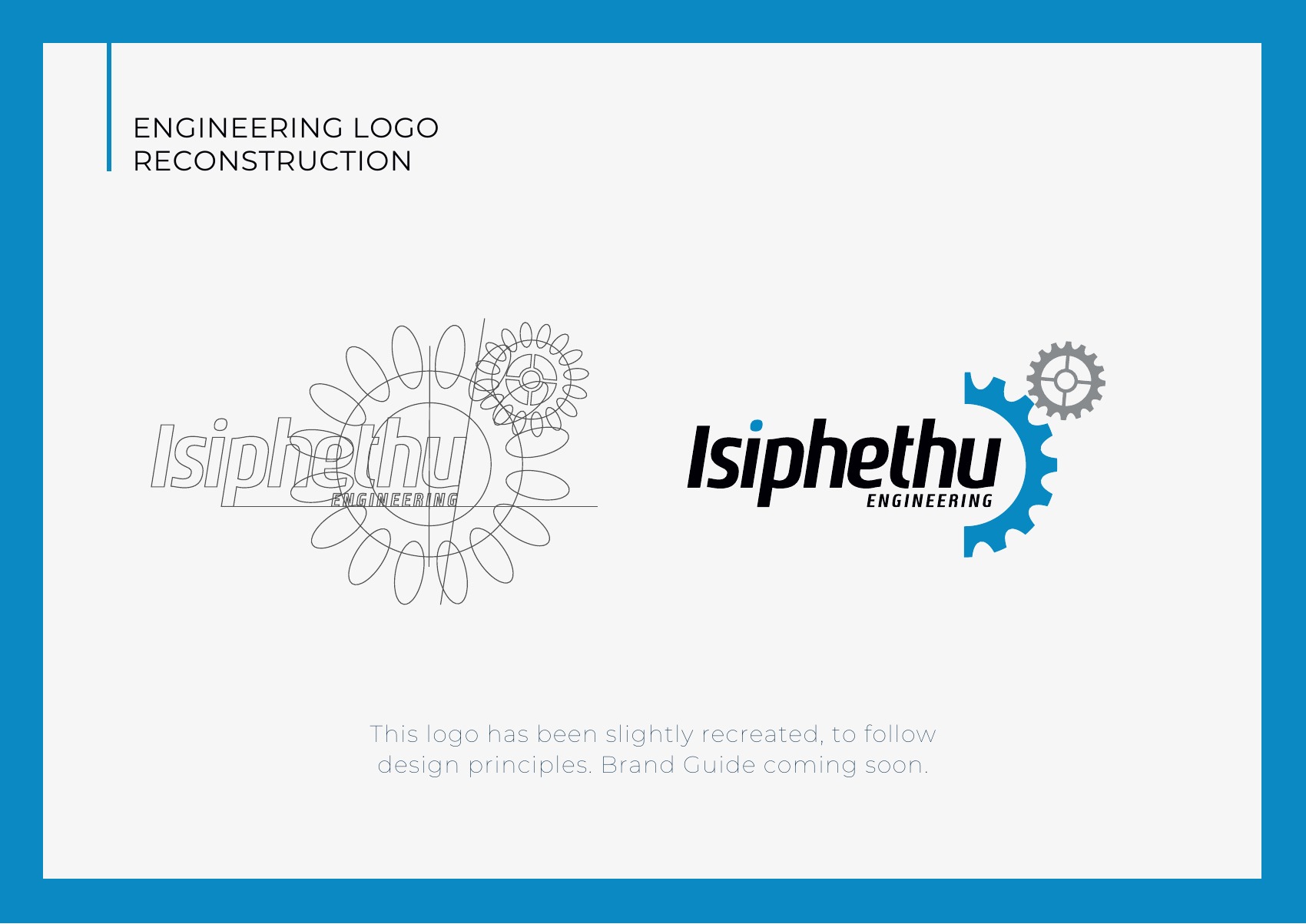
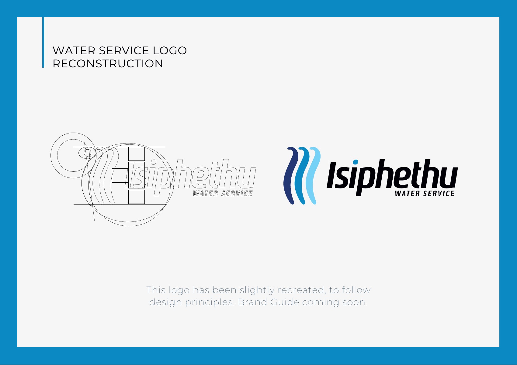
The guide also documents logo reconstruction studies for Engineering and Water Service. These explore how service-specific symbols can sit alongside the Isiphethu name.
They are presented here as development work from the guide, with the master identity providing the common foundation.
For engineering & water-services businesses
Can you create brand guidelines for an engineering or construction company?
Yes. For Isiphethu we delivered a visual identity and brand guide covering logo construction, clear space, colour, typography and usage rules.
Can our identity cover different divisions or services?
Yes. Isiphethu’s guide includes logo studies for its Engineering and Water Service divisions, sitting alongside the master identity.
Will the brand work on vehicles and workwear?
We design identities that stay legible and consistent on vehicles, workwear and everyday items, and show them as concept mockups before production.
Do you design corporate documents like company profiles?
Yes — stationery, company profiles and other corporate communication, designed to give your logo room and keep your voice consistent.