Case Studies
Santi Universe
Branding Financial Power
When tasked with designing the logo for Consolidated Holdings, we set out to create a brand identity that reflects the company’s strength, stability, and commitment to excellence. Inspired by the power of simplicity in branding, we developed a logo that speaks to the essence of Consolidated Holdings as a leader in diversified investments.
Santi Universe
Branding Financial Power
The Philosophy of Simplicity and Significance
A brand is more than just a logo—it’s a statement. A great logo isn’t just seen; it’s felt. It communicates meaning at a glance, using the power of simplicity to leave a lasting impression.
Think about the most iconic brands in the world—their logos are strikingly simple, allowing the brand’s message to shine through every other element. Even the Christian Cross, one of the most recognized symbols in history, is just two intersecting lines, yet it carries immense meaning.
This philosophy was central to our approach when designing the Consolidated Holdings brand identity. By embracing minimalism, strength, and clarity, we crafted a logo that captures the essence of trust, stability, and long-term vision—values at the heart of Consolidated Holdings’ success.
The Story
About Project
Client Name: Consolidated Holdings
Industry: Investment and Holdings
Services Offered: Brand Identity & Logo Design
Consolidated Holdings, founded with a mission to drive investment growth and financial stability, required a logo that would embody its leadership and long-term vision. The challenge was to craft a brand identity that reflects the company’s diversified portfolio while maintaining a clean, professional, and forward-thinking aesthetic.
Our design process began with a deep understanding of Consolidated Holdings’ core values—strategic growth, financial strength, and customer-focused innovation. Through close collaboration with the client, we ensured that the final identity conveys trust, stability, and adaptability in an ever-evolving investment landscape.
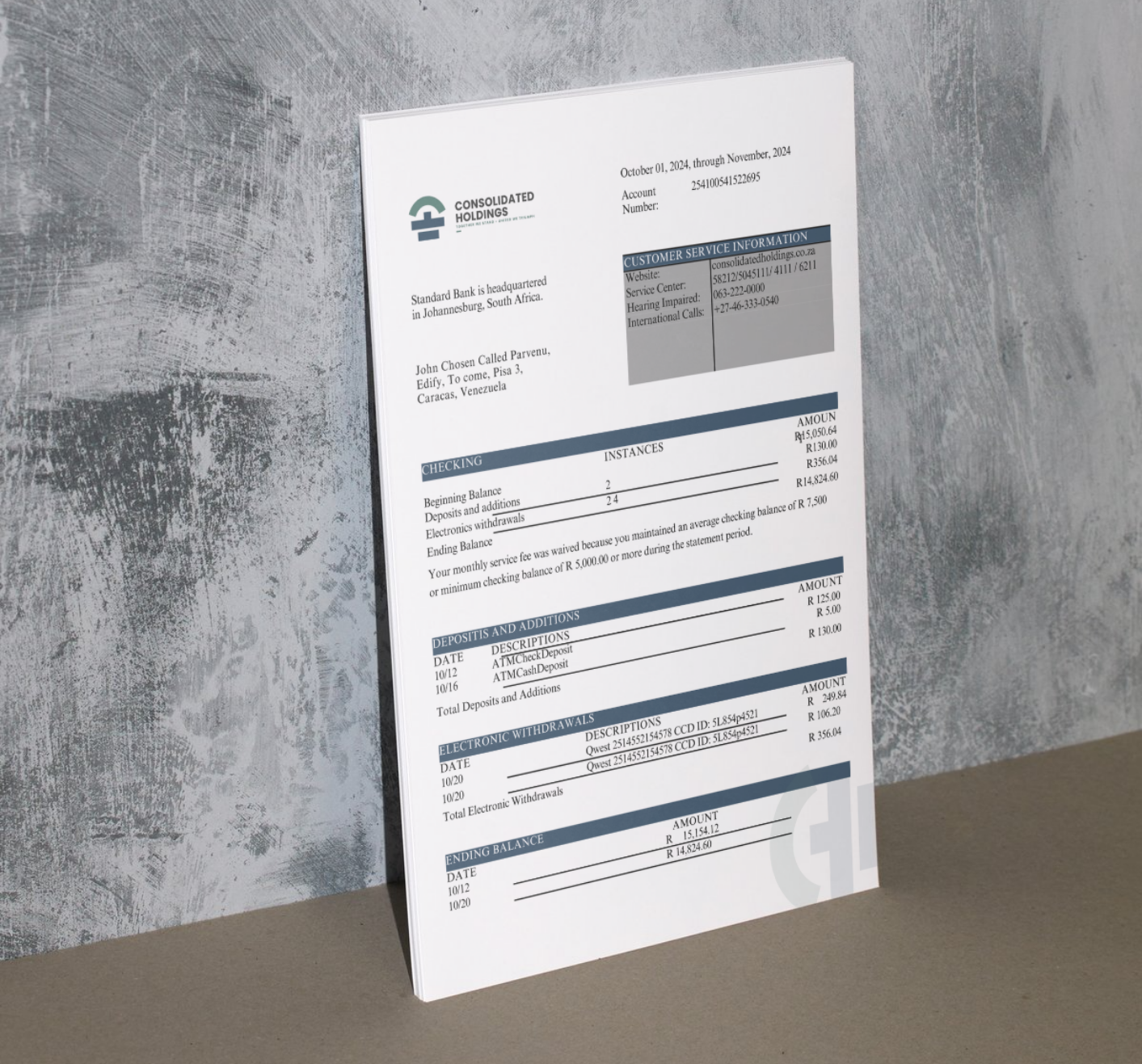
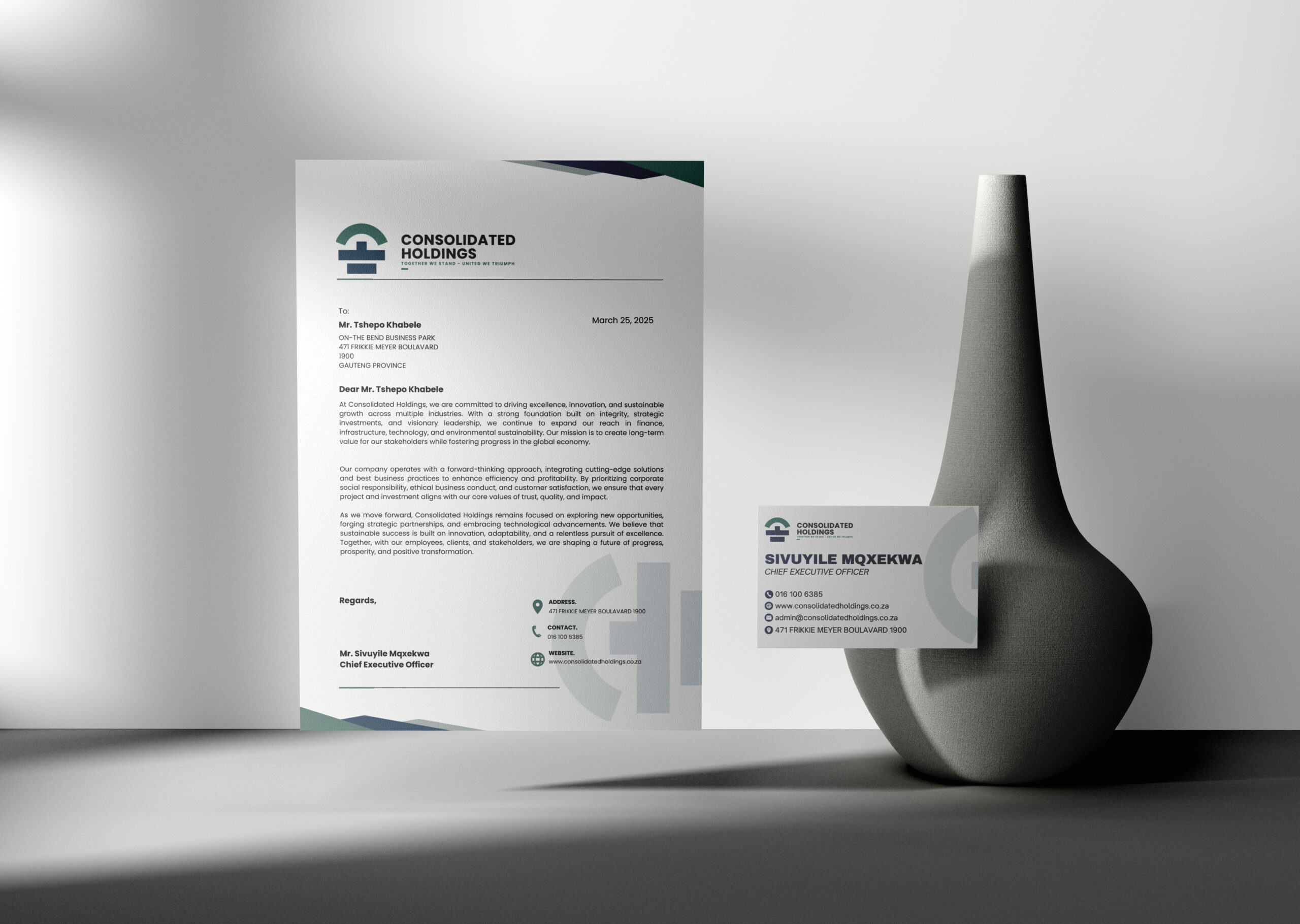
The final logo encapsulates Consolidated Holdings’ strategic approach to investment and financial success. We incorporated modern, clean typography with a minimalist yet bold icon, symbolizing professionalism, resilience, and trust.
The color palette was deliberately chosen to reflect financial strength and corporate excellence, reinforcing the company’s position as a leader in the industry. The typography enhances readability and exudes confidence, ensuring instant recognition in a competitive market.
By leveraging the power of simplicity and precision, we developed a timeless brand identity that positions Consolidated Holdings as a trusted and forward-driven investment powerhouse.

