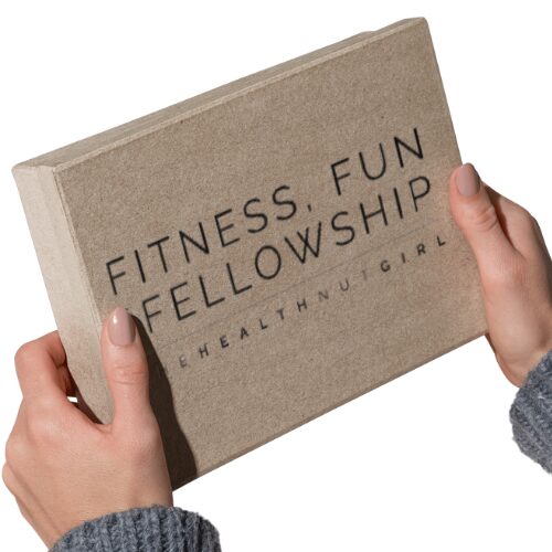
When your brand is born, it deserves a logo; it’s the foundation of your brand
See how we helped ‘Fitness, Fun and Fellowship’ take that first step.
At Santi Universe, we don’t just design logos – we craft identities that tell your story and connect with your audience.
One of our recent projects:
FITNESS, FUN AND FELLOWSHIP
A growing brand in the Fitness and Community Wellness Industry, focused on empowering individuals to achieve their health and wellness goals. They approached us to design a fresh, bold, and modern logo that would resonate with their target audience of young professionals and fitness enthusiasts.
The challenge was to create a logo that would capture all three core values – fitness, fun, and fellowship – in a single, cohesive design.
- Fun – to capture the playful, energetic side of fitness.
- Inclusive – representing a space where everyone feels welcome, no matter their fitness level.
- Community-driven – embodying fellowship, support, and motivation.
Here’s a behind-the-scenes look at how we brought their brand vision to life with a logo that truly represents their energetic, community-driven spirit.
THE PROCESS
Research
We started from scratch, exploring how to visually represent the three core values of the brand. Our research focused on understanding how to blend community-oriented design elements with fitness imagery while maintaining a fun, approachable feel.
Design Development
For the logo of Fun, Fitness, and Fellowship, we sought to create a unique and meaningful design that not only represented the brand’s core values but also conveyed energy, connection, and wellness.
Creative Concept
After thorough brainstorming and conceptualization, we decided to craft the logo around the brand’s initials—FFF—to form a simple yet powerful visual identity.
The design process was guided by the idea of movement and flexibility, which are central to both fitness and yoga. We incorporated the three capital letter Fs into the icon, each one representing a core element of the brand: Fun, Fitness, and Fellowship.
To add depth and creativity to the logo, we used a combination of yoga-inspired shapes. The head of the first F was designed to resemble a yoga pose, symbolizing balance, mindfulness, and the wellness aspect of the brand.
The rest of the logo features flowing, cursive-style Fs that emphasize movement, connection, and the dynamic nature of the community that the brand fosters.

This thoughtful blend of strong typography and elegant design elements perfectly encapsulates the spirit of Fun, Fitness, and Fellowship, ensuring that their first-ever logo speaks to the brand’s mission of bringing people together through fitness, fun, and shared experiences.
RESULTS
We delivered a distinctive first logo that established FITNESS, FUN AND FELLOWSHIP’s brand identity. The design achieved several key objectives:
-
Created a strong foundation for the brand’s visual identity from scratch
-
Successfully incorporated elements representing fitness, community, and enjoyment
-
Provided versatile applications across various marketing materials and platforms
Crafting Effective Logos for Long Company Names:
By simplifying the design, using strategic typography, and incorporating balanced spacing and icons, we created a logo that is clear, compelling, and adaptable. Our approach ensures that long company names have distinctive logos that work across various platforms and effectively represent the brand.
The final Logo Icon combines a dynamic symbol representing movement with bold typography to reflect strength and energy.


The Color Palette features energetic and motivating tones,
and while The Font could be customized in the near future, it conveys a modern, professional aesthetic.

“I love it!”
Your Title Goes Here
Ready to bring your brand to life with a unique logo that speaks to your values?
Let’s create something unforgettable together. Contact us today to start your design journey!
