CRAFTING A LOGO FOR A COMMODITY INDUSTRY LEADER
A detailed journey of our design process, from research to delivering a logo that captured the essence of our client’s business.
Client Name: MAKATI
Industry: Commodity
Services Offered: Logo Design
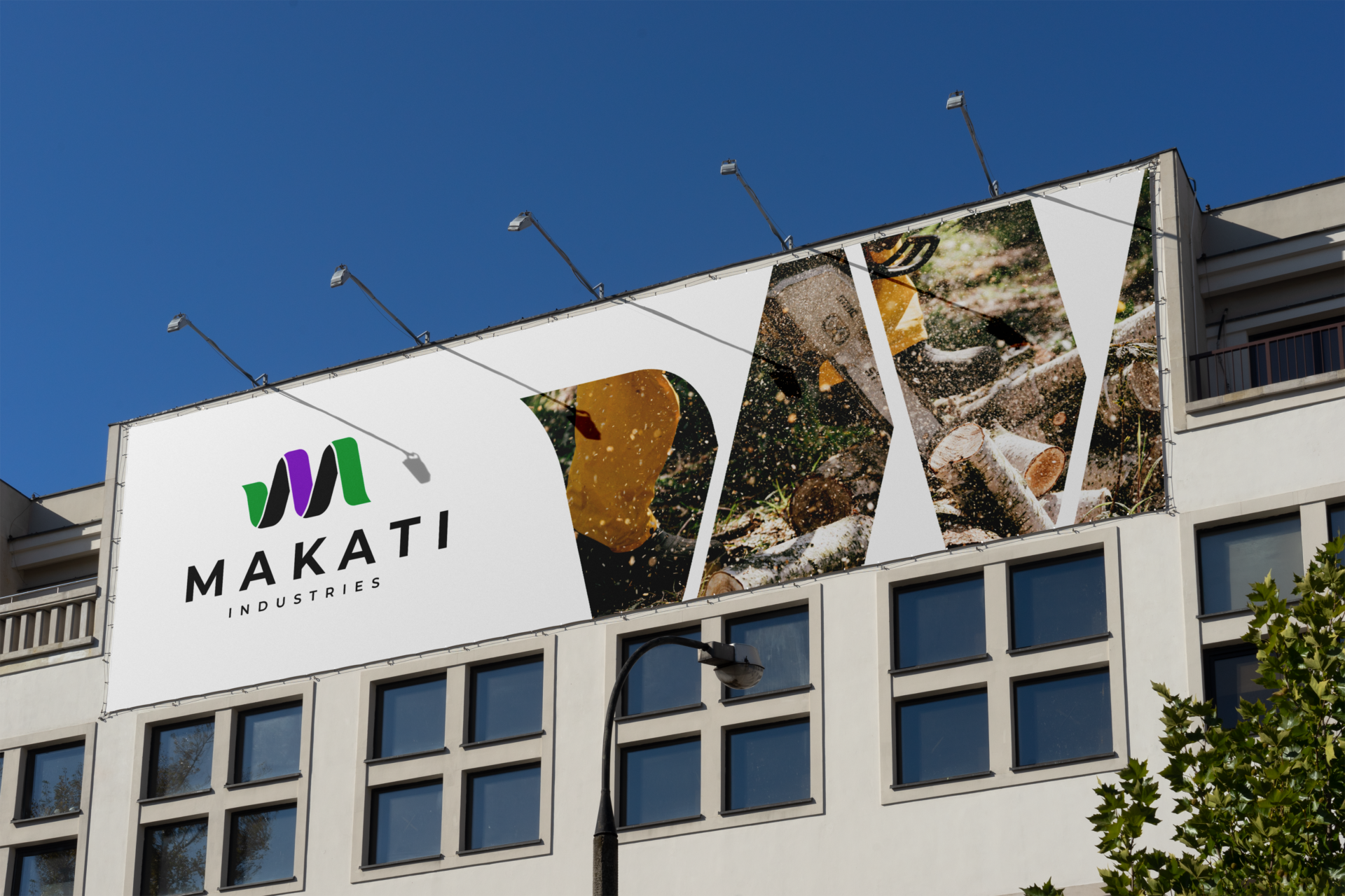
OVERVIEW
Our client, a key player in the commodity industry, approached us with the need for a distinctive and meaningful logo that would represent their business’s values, mission, and align with its brand identity.
Our task was to design a logo that not only reflects the brand’s essence but also gives it a modern, professional edge.
The Creative Challenge was to create a logo that not only communicated the brand name but also resonated with the meaning behind the name, “cat.”
THE APPROACH
Research:
We began the process by conducting in-depth research to understand the commodity industry, our client’s brand identity, and their audience.
Our research phase included:
- Analyzing the client’s competitors and industry trends.
- Identifying the target audience and their expectations.
- Collaborating with the client to uncover their core values and goals.
Findings:
The name “MAKATI” is directly translated to “cat,” which led to a creative opportunity to incorporate the imagery of a feline in the logo.
Our approach began by exploring the broader feline family, which includes various types of cats—among them, the leopard. This idea was chosen for its elegance, strength, and distinct visual characteristics, allowing for a logo that felt both organic and modern.
The challenge was to translate the essence of a leopard’s form into the logo’s design while ensuring the resulting symbol remained soft, approachable, and versatile.
With these insights, we brainstormed ideas and developed initial sketches that reflected the essence of their business.
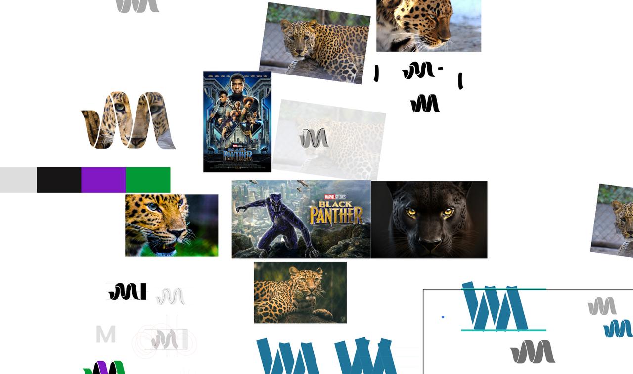
DESIGN DEVELOPMENT
The creative process began with a focus on the leopard, a majestic and dynamic member of the feline family. The objective was to soften its typically sharp, angular features to make the logo feel more fluid and inviting, while still maintaining its strength and elegance.
Creative Concept
The first step was to use the outline of the leopard as the basis for the logo’s iconography. The idea was to capture the essential qualities of the animal without making the shape overly complex or detailed.
The focus was on creating smooth, flowing lines.
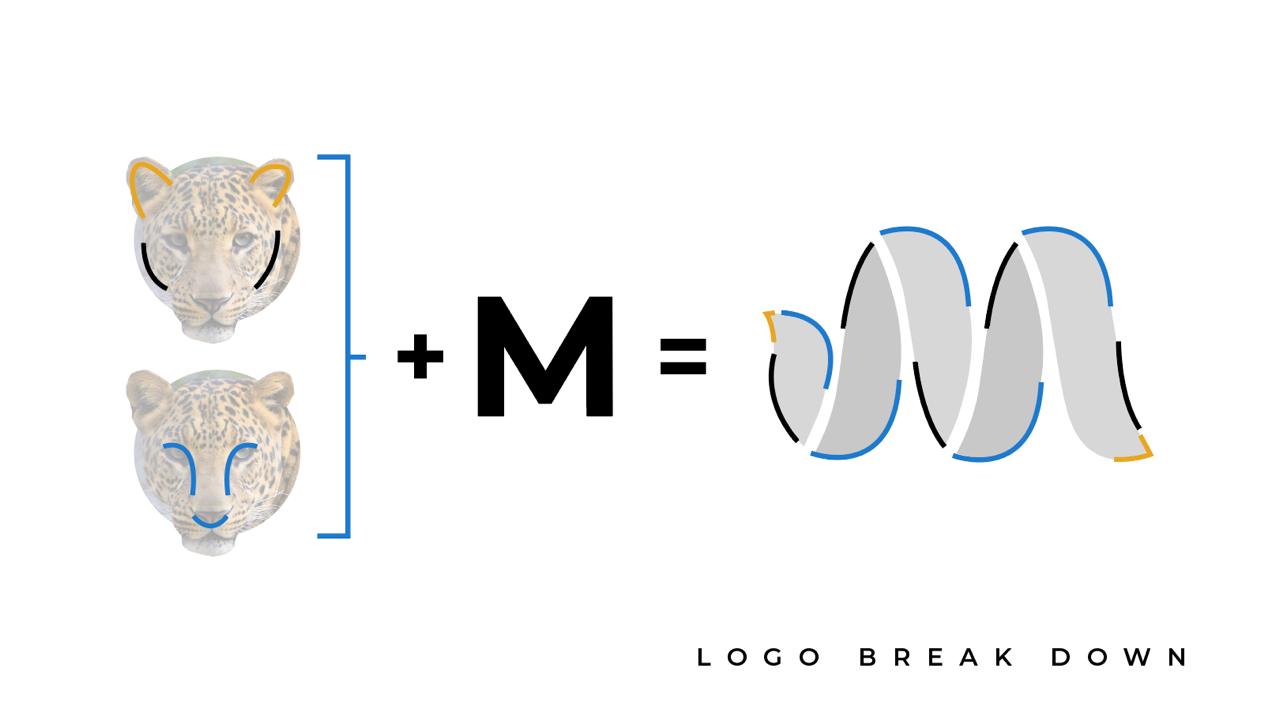
The outer contour of the leopard’s face, which is rounded and soft, was translated into the curves of the letter “M.” The M’s edges were designed to mimic the soft curves of the leopard’s ears, avoiding sharp lines and instead emphasizing rounded, harmonious shapes.
Another key element in the design was the internal shape of the leopard’s eyes and nose, which have slightly curved, organic forms. These shapes provided the inspiration for the inner structure of the “M” in the logo. The eyes and nose of the leopard naturally lend themselves to creating a subtle, soft “M” shape that is both unique and elegant.
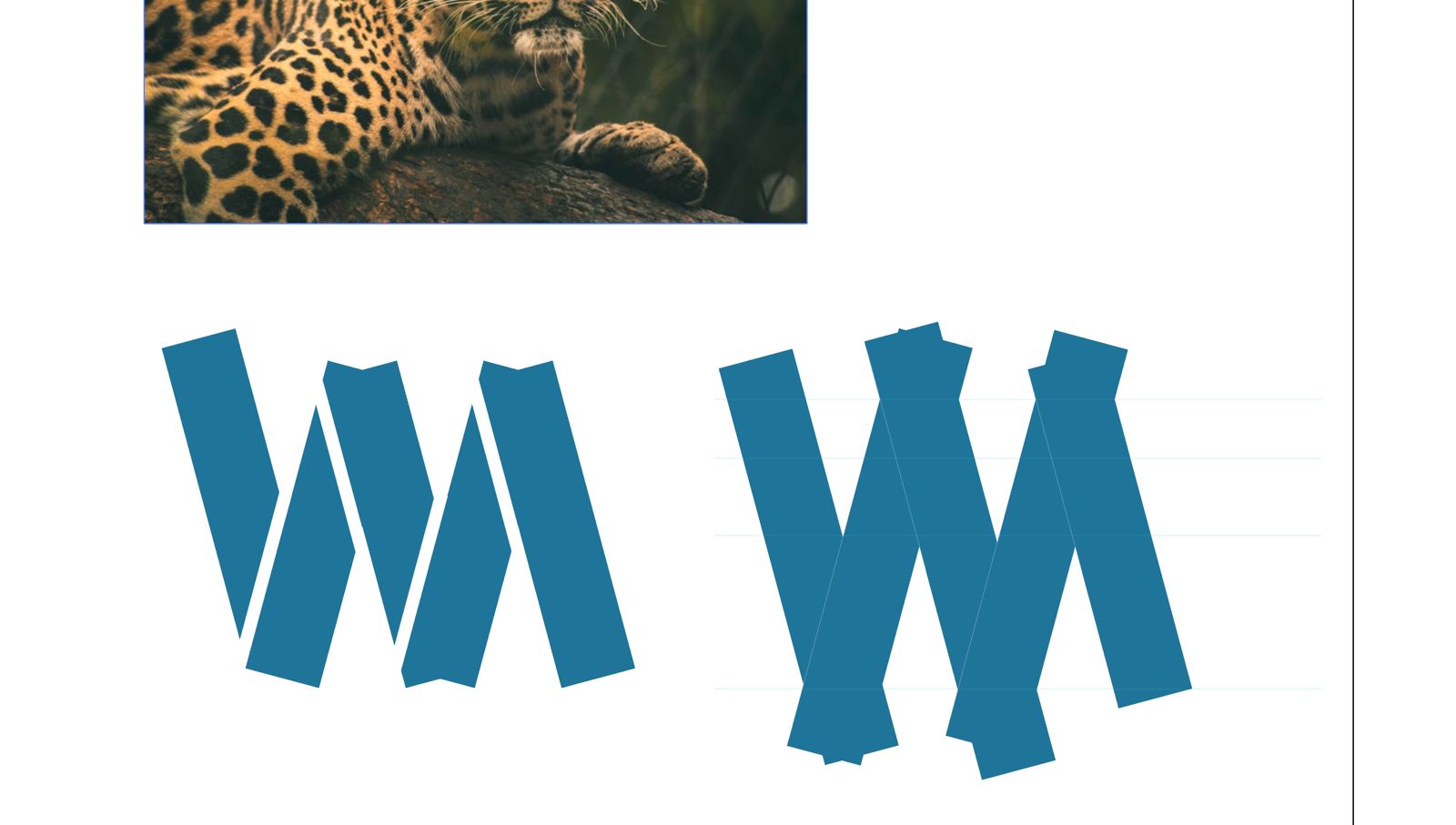
To bring structure and balance to the design, we experimented with geometric shapes—specifically rectangles. By arranging these shapes vertically and creating space between them, were were able to carve out the flow of the letter “M” in a consistent, geometric manner. This method provided a solid framework from which to refine the design and explore the potential for softening the “M” into a more fluid form.
After outlining the “M” with rectangles, the next step was to soften the sharp angles and edges to better reflect the gentle, rounded nature of the leopard. This involved refining the curves and ensuring all lines were smooth and cohesive.
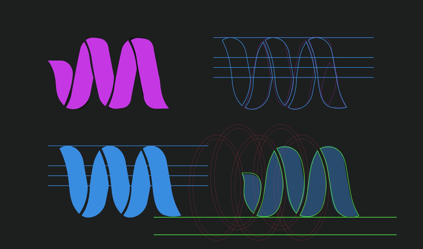
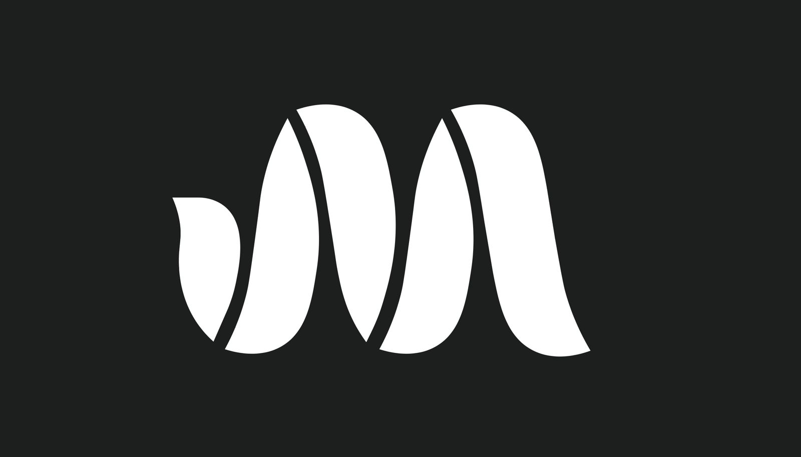
The final letter “M” shape was carefully balanced to ensure consistency and alignment across all elements.
Typography
Once the icon was finalized, the next step was to incorporate the company’s name into the logo. The typography choice was crucial in maintaining the balance of the design.
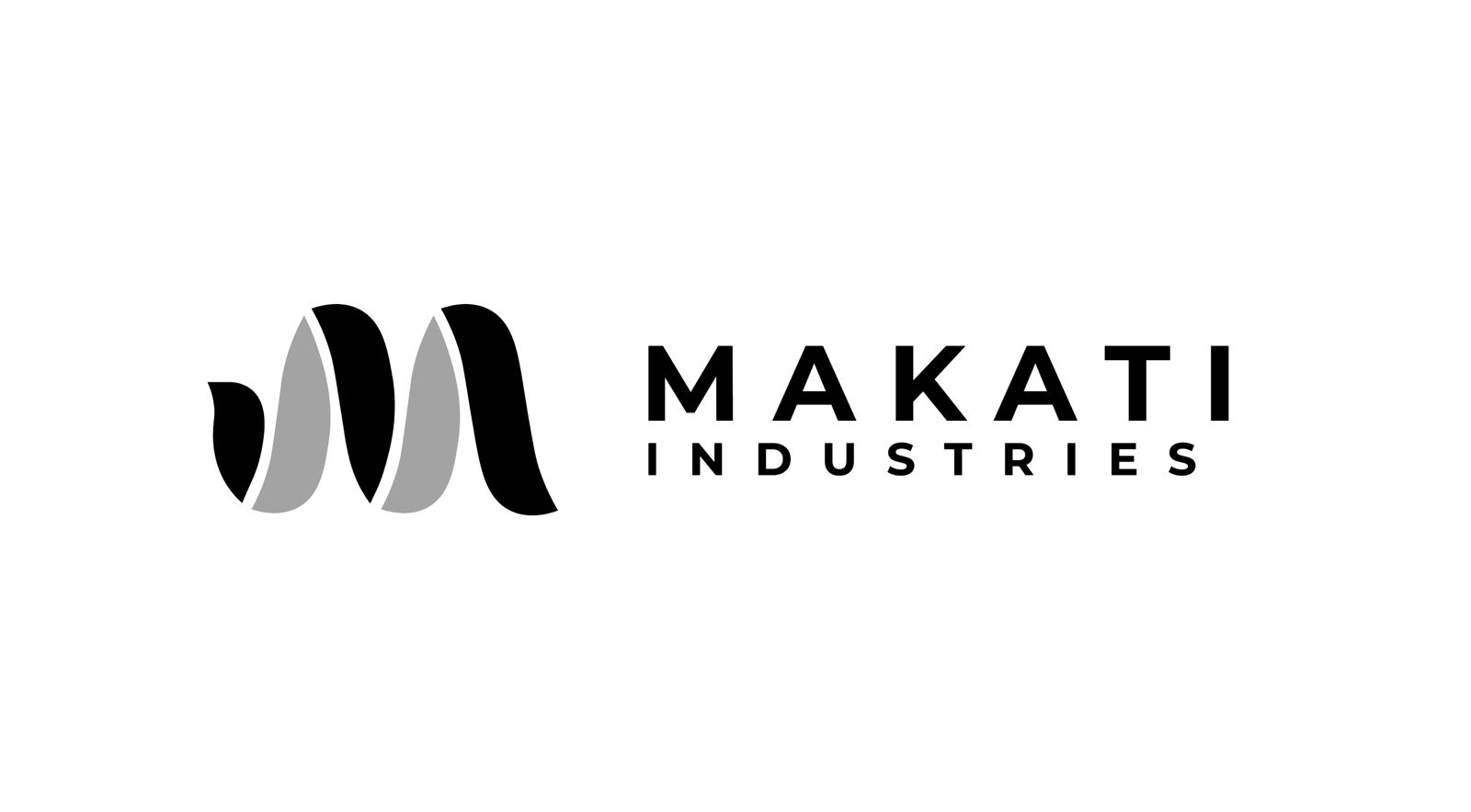
For the company name “MAKATI,” we used the Font Montserrat in bold. This font was chosen for its clean, modern, and highly legible style. The bold weight of the font gave the name prominence, ensuring it stood out alongside the iconic “M” while maintaining the logo’s overall balance.
Beneath the name MAKATI, we added the word “INDUSTRIES” in a smaller, non-bold weight. The reduced font size and lighter weight allowed the focus to remain on MAKATI while still clearly conveying the company’s full name. The spacing between the letters was carefully adjusted to maintain a sense of harmony between the two parts of the name.
Color Scheme
The client chose a striking color palette that combined bold and fresh tones with neutral shades, providing a professional yet vibrant feel.
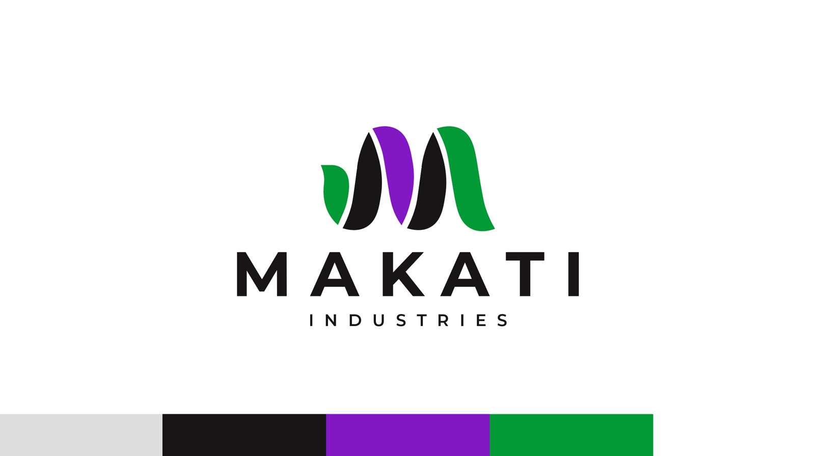
- Greyish (#DDDDDD): This light grey adds a subtle background element, softening the overall palette and contributing to the logo’s versatility across different applications.
- Black (#171516): Used for the typography and certain elements, anchors the design, providing contrast and sophistication.
- Purple (#8118C4): Symbolizes creativity, luxury, and innovation, the purple hue brings a sense of sophistication and uniqueness to the logo.
- Green (#009A36): Represents growth, stability, and sustainability, green adds a natural, grounded element to the logo, complementing the industry’s core values.
- White (#FFFFFF): White was utilized for clarity and balance, allowing the other colors to pop without overwhelming the design.
RESULTS
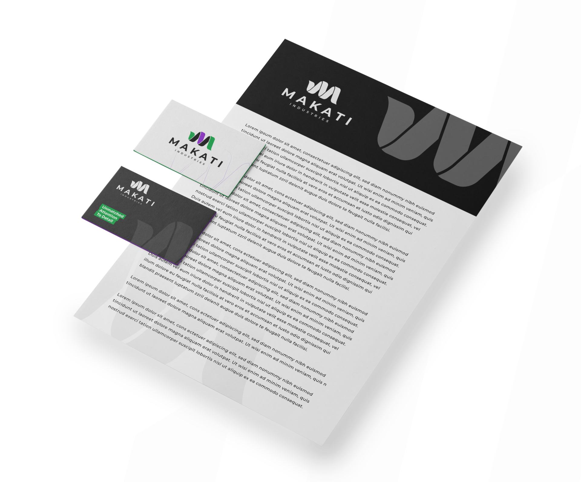
The final logo successfully combines both the visual and conceptual elements that reflect MAKATI’s values. The leopard-inspired icon conveys strength and elegance, while the clean typography adds modernity and professionalism. The color palette reinforces the brand’s identity, combining sophistication with vitality.
In the end, the MAKATI logo is a distinctive, memorable symbol that is flexible across various mediums, from print materials to digital platforms.
It successfully represents the brand’s core values and positions MAKATI as a modern, innovative leader in the commodity industry.
“The logo exceeded our expectations! It perfectly embodies who we are as a company, and we’ve received countless compliments from our partners and customers. Thank you for bringing our vision to life!”
Final Thoughts
This project was a testament to the power of collaboration and research-driven design. By understanding our client’s needs and industry, we were able to deliver a logo that not only met but exceeded their expectations.
If you’re looking to elevate your brand’s identity, we’d love to help. Reach out to us, and let’s create something extraordinary together!
